The Real Life Bananaphone!
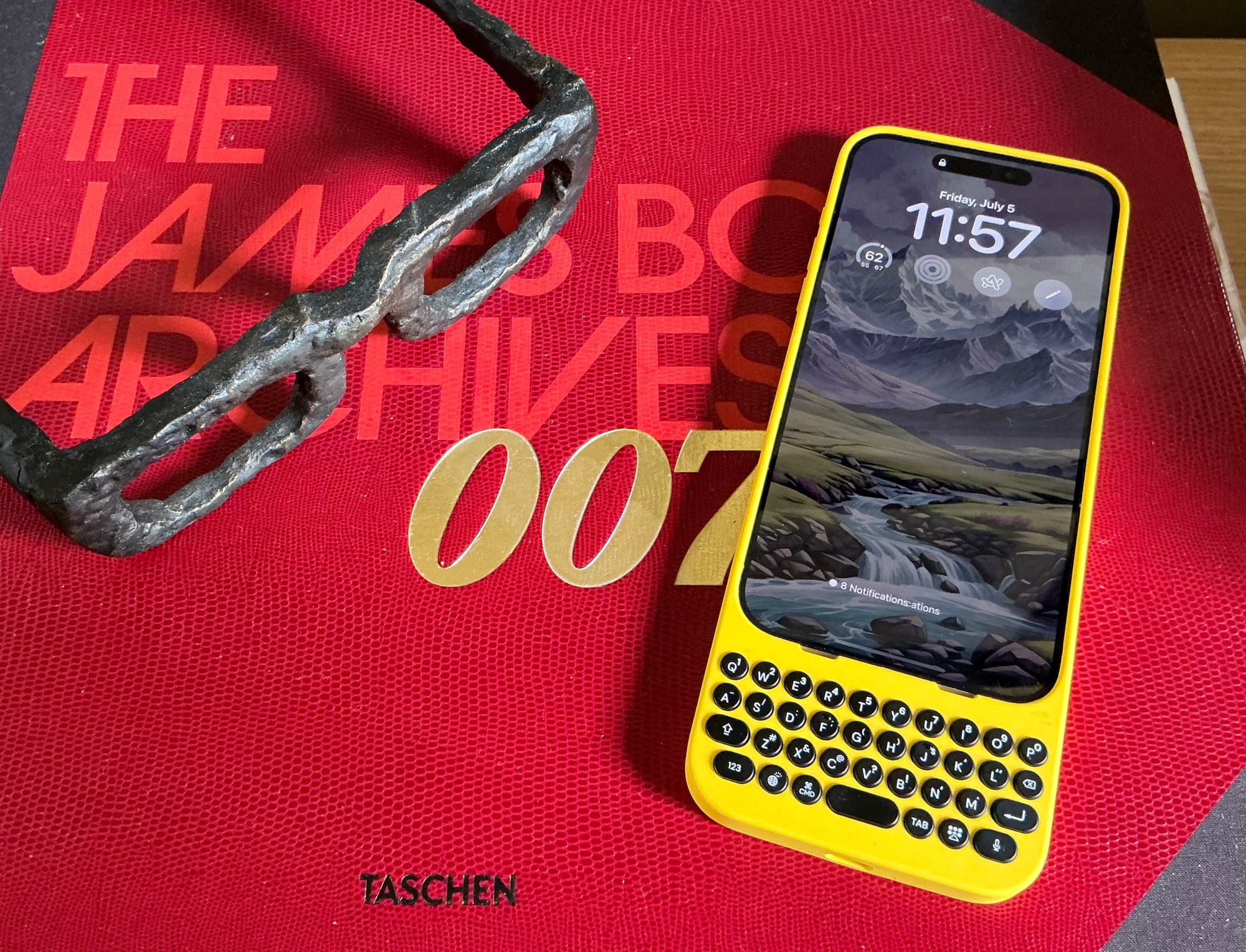
I vividly recall some of the vitriol from the early days of the iPhone when a certain subset of people were certain the device was doomed because it didn't have a physical keyboard. That included Steve Ballmer.1 This was the heyday of BlackBerry, and what was Apple thinking? Well, in large part, they were thinking about screen sizes. No physical keyboard meant Apple could include a massive screen, perfect for not only touch but as it turns out, multi-touch. Anyway, this all made perfect sense to me 16 years ago, so why on Earth did I buy the new Clicks keyboard device?
Well, first and foremost to try it out. We're far enough removed from the physical keyboard iPhone debate where it's now sort of interesting again to think about the device with one. It's obviously something Apple will never do, as the ship has sailed with the industry now fully behind Apple and BlackBerry a seed of its former self. But we're all these years into the standard glass slab, with Apple not yet in the foldable/flipable game. So why not switch it up and try something new?
The reason is because it's ridiculous to add a physical keyboard to a device the size of current smartphones. Especially if you have the iPhone 15 Pro Max, as I do. With the Clicks keyboard added on, it's so comically long that it causes all sorts of usability issues. But it's also still a little fun! Especially if you get the one in yellow, as I did. I mean, it's the real goddamn Bananaphone!
Ring. Ring. Ring. Ring. Ring. Ring. Ring. Ring. Bananaphone!
But is it any good? I mean, not really. They keyboard itself is fine, but it's mildly hard to type with because the device is so top heavy. Clicks is quick to tell you to not try to hold it in the way you would have a BlackBerry – the "prayer" position – and instead to sort of cradle it, to get better support because beyond just typing on the keyboard, you're going to need to be touching the screen, of course. I'm sure this all works a bit better with a non-Max sized iPhone, but I'm also sure it's still not an ideal layout. Screen sizes and as such, smartphones, are just too big these days to do this physical keyboard at the bottom thing. Again, the thing looks like one of those farcical CVS receipts.
I will say that it is nice to have all of your screen real estate freed up in apps where the digital keyboard typically pops-up, like email. It's nice to write in such apps, especially if you're sitting in a chair where you can fully cradle this device (and not have to worry about it toppling over). Also nice is how well it works with modern AI wizardry such as typing suggestions in Gmail. Can your BlackBerry do that?!
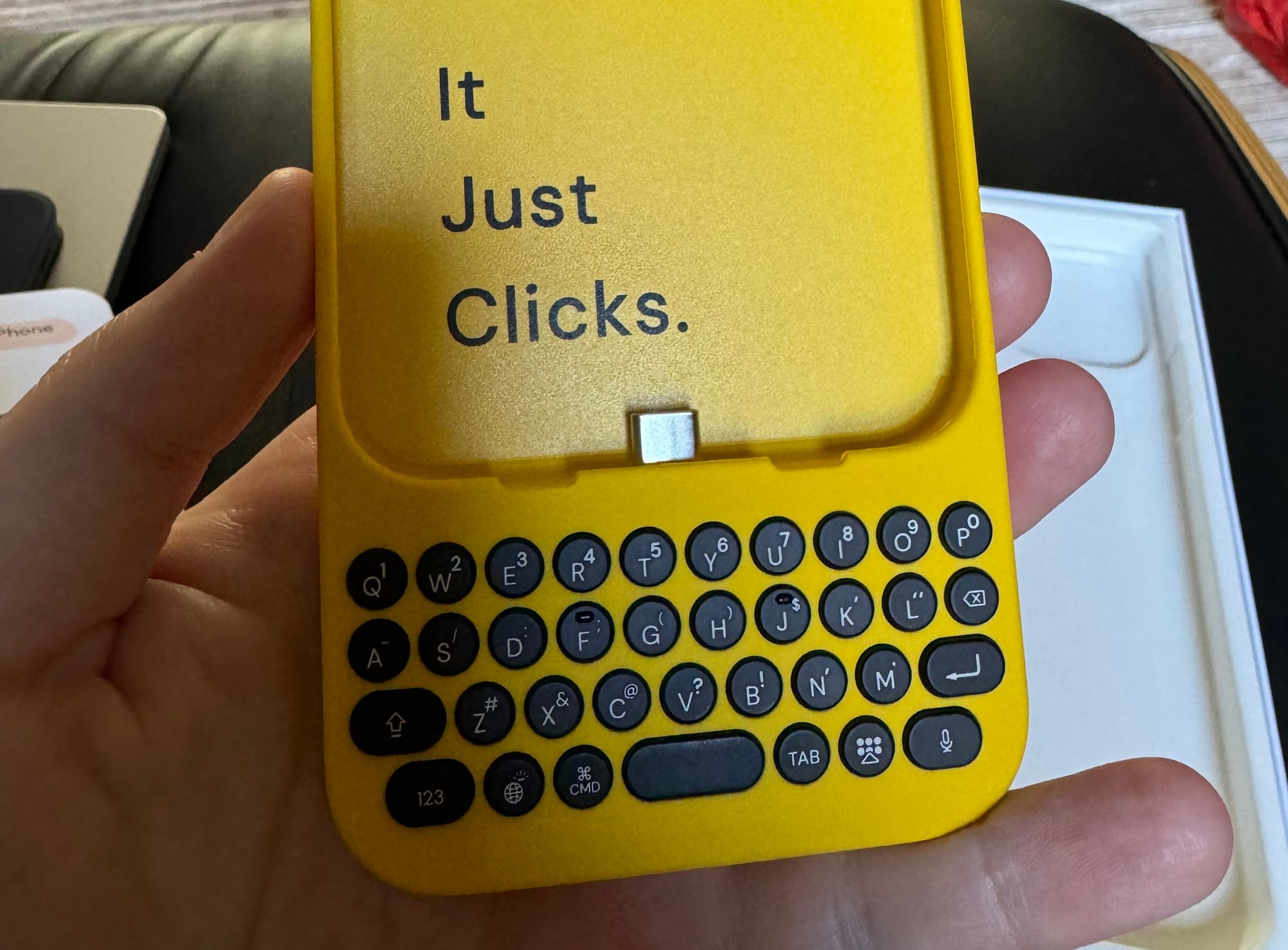
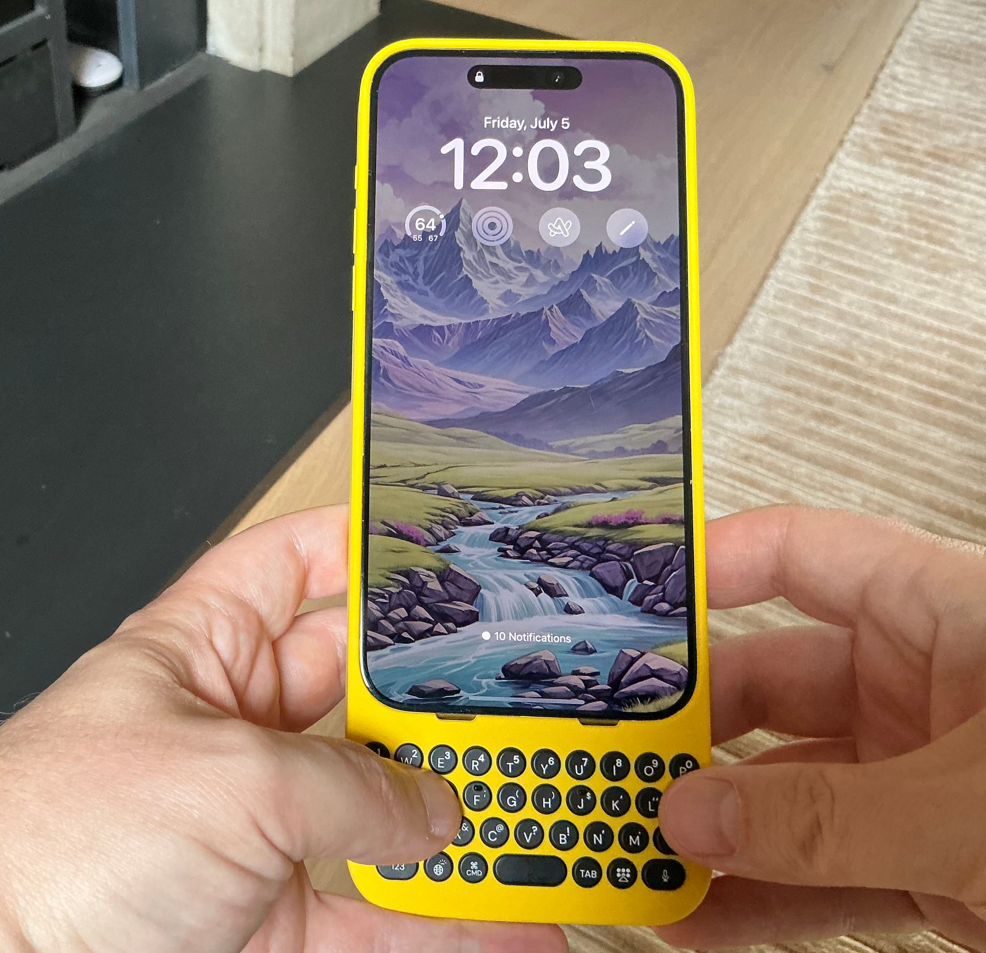
Honestly, I wish Clicks had made a horizontal keyboard. That sounds potentially even more crazy but whenever I'm using this thing, I can't help but feel that an elongated keyboard would both feel better to use in your hands (the vertical keyboard is too narrow for comfortable two-hand use) and would further highlight the freed-up screen real estate. Right now, using the iPhone in landscape mode is a bit silly for everything beyond watching video or playing games. The digital keyboard when used in that position takes up too much screen real estate. A landscape Clicks could and would solve this!
You can use it horizontally to type now, but it requires even further breaking of your brain to type that way. And it's just even more awkward to hold that way. But a horizontal keyboard at the bottom of the device... I think there's something there. But they also must have thought about this and concluded it wouldn't work well for some reason or reasons.2
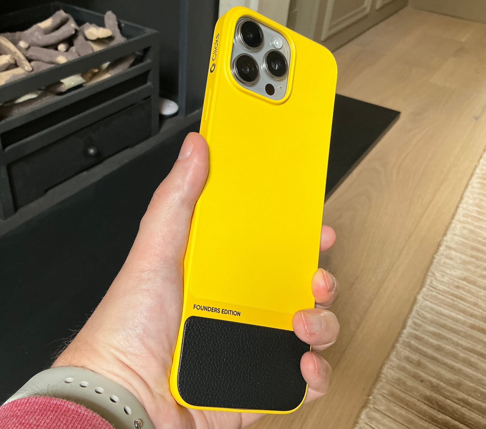
What else? Even though it's preposterously large, Clicks still has the camera bump issue when you try to lay the device down on its back. This is Apple's problem, of course, but it's also now Clicks problem because your natural inclination is not to lay the device on its front where the keys would touch whatever surface you're laying it down upon (there is a "lip" to protect the screen).
The sides of the case are nice and grippy, though the back is pretty slick and plastic-y. It's easy enough to take on and off, which is nice and many cases – including many of Apple's own – fail at this.
There's also a Clicks app which allows you to both update the firmware and change the backlit keys settings – yes, the keys are backlit! That also adds to the power-draw element, but it doesn't seem too bad. The app also reminds you of the nice keyboard shortcuts baked into the physical keys.
Lastly, the price, while not insane, is high at $159 (the version for the non-Max iPhones is cheaper at $139). If you're going to use this device on a daily basis, sure. But if it's more a novelty used in certain conditions, less sure.
Look, this was never going to be a device I loved. And I suspect most won't love it in 2024, even though many would have in 2008. But kudos to Clicks for trying something new and old in our era of black slabs of glass. I'm intrigued by my landscape keyboard idea, but I also know I'm not the only one to have thought of that.3 So there's clearly a reason why they made the Bananaphone which will protrude out of even the deepest pants pockets. I won't go there and connect the obvious joke dots. I'll go the other way...
Cellular, modular, interactivodular! Sadly, it's not quite the best.

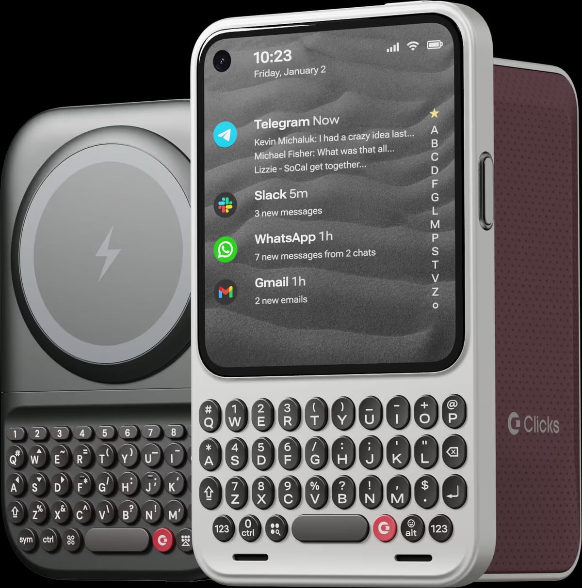
Update January 3, 2026: This team is back with a couple compelling new additions!
1 "And it doesn't appeal to business customers because it doesn't have a keyboard, which makes it not a very good email machine."
2 Obviously, the port is at the bottom of the phone which both powers and passes on the keyboard input. But I think they could figure out how to still tap into that with a side USB connection (on the Clicks). Or they could use Bluetooth to connect, of course.
3 How you would fit a landscape keyboard tacked on to your iPhone in your pocket, I have no idea. It would probably need to be kept in a bag. But that made me think: what if it's a fold-over keyboard? As in, the keys fold over the phone's screen like the iPad keyboards? Is that crazy?


