Branding Iceberg, Straight Ahead!

Look, the uniforms are fine. Nice even. They're simple. But the Los Angeles Clippers new logo is something else. Something quite bad.
Yes, we all get what they're going for. It's nautical. Not because owner Steve Ballmer was very famously associated with Seattle (via Microsoft) and this has a very Seattle Mariners vibe,1 but because of the 'Clippers' name, which may seem generic but is actually tied to their time in San Diego and that city's famous bay.2 This is where the real problem starts though.
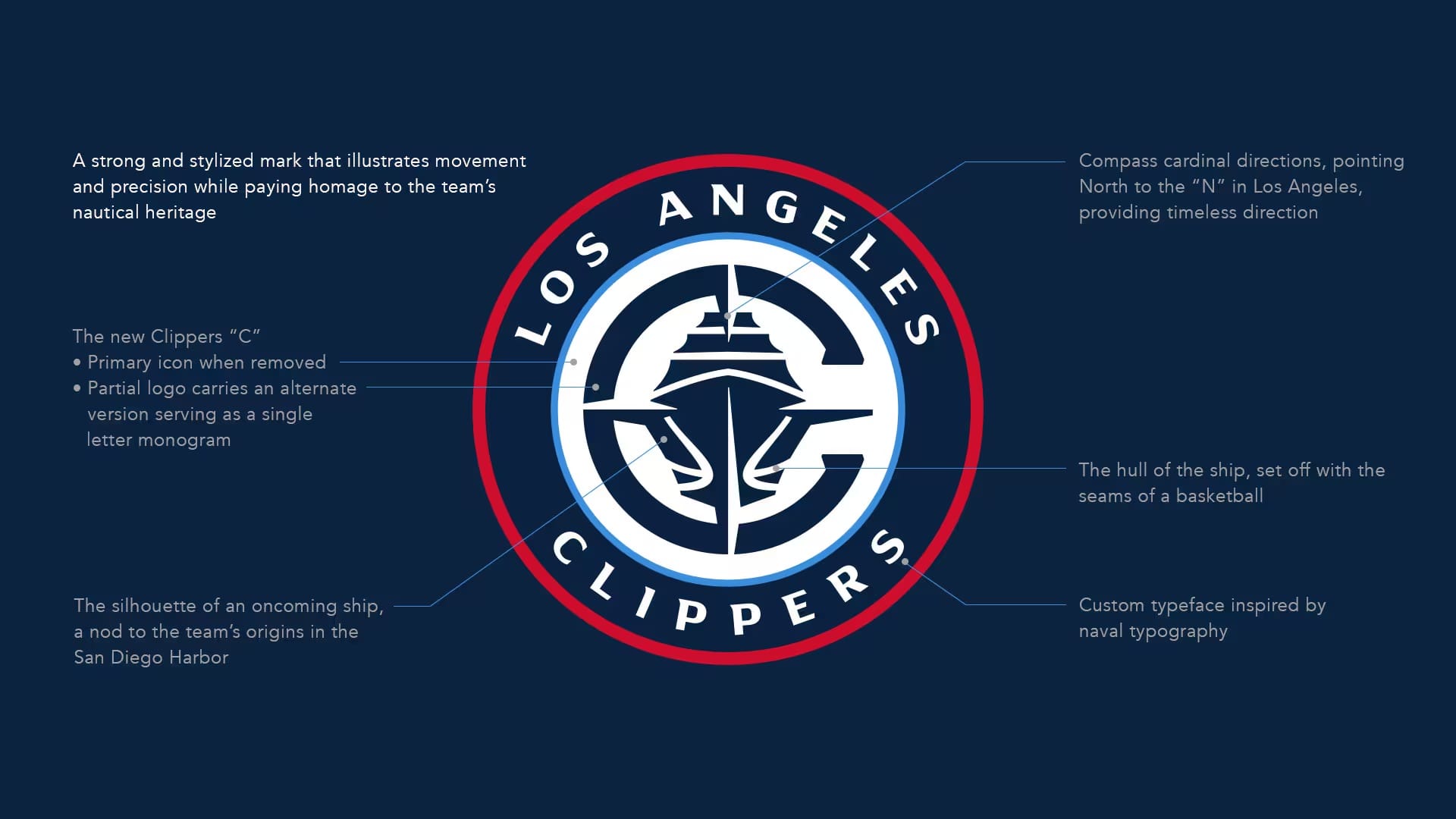
A 'Clipper' is most commonly associated with a type of mid-19th-century merchant sailing vessel. But really, any sailing ship will probably do, because that was a part of San Diego. Instead, here, we get a cruise ship. Or perhaps a mega yacht? Whatever it is, there's not a sail to be billowed. A logo featuring a boat with big ass sails could have been cool. Instead, we have the Titanic. With a giant, almost round horseshoe-like 'C' around it.3 And a compass.4 Just in case the Royal Caribbean mega ship didn't drive home the nautical theme.
I'm sort of surprised we don't have a lighthouse and a seagull somewhere in here. Where's the fucking anchor? Are they even trying?
Did you notice that the hull of the ship features the seams of a basketball? I didn't either because that's not actually what the seams of a basketball look like. Nor does it make any sense. Instead, they sort of look like foot marks left by a giant bird. Wait, maybe there's our seagull!
At least you can't possibly go wrong with that color scheme.5

1 And originally tried to buy a team (the Sacramento Kings) to move back to Seattle to bring back the SuperSonics, which is what he should have done, as there's no way they change up that iconic branding.
2 Yes, it's strange that Los Angeles has not one, but two teams affiliated with water from other places.
3 Which is not like the 'C' on their uniform. We'll cut them a break though since the 'S' in 'Spyglass' isn't the same 'S' as is found in my wordmark either.
4 The compass does point to 'N' in 'Los Angeles', a nice touch, I guess? Of course, the bottom doesn't point to any of the three 'S's in 'Los Angeles Clippers', it points to 'P', as in 'Pouth'? Perhaps they didn't want to be associated with a team going south, which is exactly what the franchise has done their entire existence, even with -- by far -- the wealthiest owner in sports.
5 Are you proud of me for not making the obvious 'Clippy' joke? And the more subtle Microsoft branding jokes I'll leave to others closer to the topic...

