Paramount's Master 'P'
At first glance, the new Paramount logo – the 'New Paramount' logo? – is pretty bad. But at least this one had a clear reason for being: it's really just a merging of Paramount's current logo and Skydance's current logo as those two aim to merge. Still, as with so many redesigns these days, it takes something absolutely iconic and hits it with the bland branding stick. Per Hunter Schwarz:
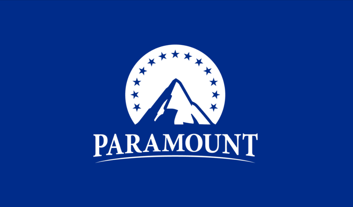
The traditional all-caps serif and thin strokes, when paired with its royal blue background, creates a wordmark resembling those in corporate consulting and investing, like McKinsey or Citadel, rather than other entertainment companies and streaming services, which largely use script or sans serif type.
With this in mind, the new post-merger logo is great if your goal is internal corporate synergy—and that may well be the case since the logo was used in a document that discusses things like strengthening balance sheets, enhancing free cash flows, and unifying key IP. But it also saps the Paramount logo of its personality. The end result is a dull logo that looks more suited to a direct-to-home-video brand than one of the most storied media companies in the world.
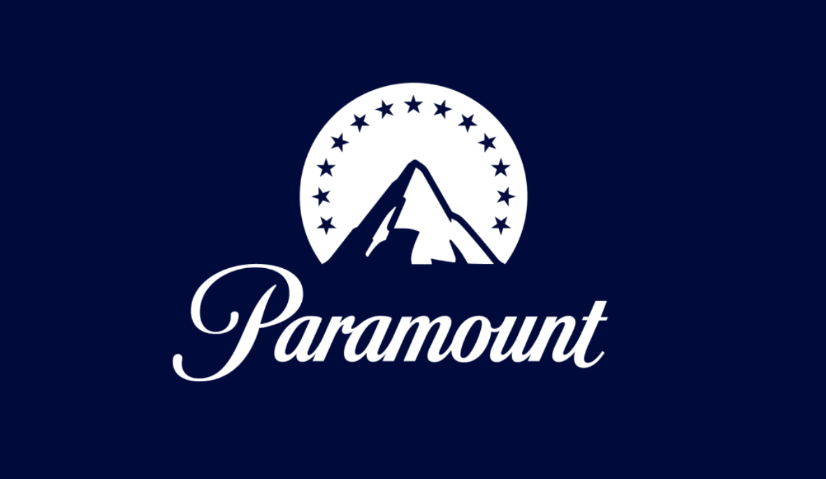
The big problem here, I think, is that Paramount's cursive 'P' is arguably almost as recognizable as the mountain and stars logo. Certainly, it's a combination of all three that make the logo iconic. Take one element away and you get, well, this.
No, it's not nearly as bad as the comical abomination Warner Bros. Discovery first threw at us. But at least that was more memorable. But yes, hopefully this, like that, is just temporary. If nothing else, is seems a bit presumptuous to invest in a new logo when your deal is in the midst of a 45-day "go shop" period, where someone else is welcome to come in with a better offer. And, of course, before this deal passes regulatory. muster and actually closes in perhaps a year.
This logo would seem to imply that Skydance will keep 'Paramount' as the overall name and brand of the new entity if and when it does close. Or again, they might just be using 'New Paramount' as a placeholder and maybe we will get 'Skydance Paramount' or the like, eventually. I still like the idea of keeping 'Paramount' as the movie studio under 'Skydance', the corporate parent (and changing the 'Paramount+' streaming service name to 'Showtime'), but I also see value in sticking with Paramount. But if you do that, I think you need to also keep the iconic 'P' and not 'Skydance' it up.
Whatever they do, they can't change this (aside from the 'A Viacom Company' part – 'A Skydance Company'?):
 M.G. Siegler