The Pixel Fold Makes the iPhone Look Old
Like millions of others, I got a new iPhone last week. The iPhone 16 Pro Max. It's pretty. It's nice. I'll have more thoughts on it soon, but I'm honestly not sure how many more thoughts there are to be had. It's an iPhone.
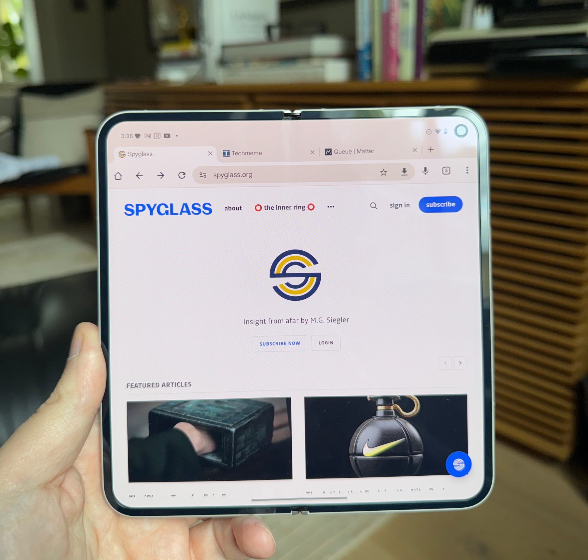
You know what's far more interesting? The Pixel Fold.
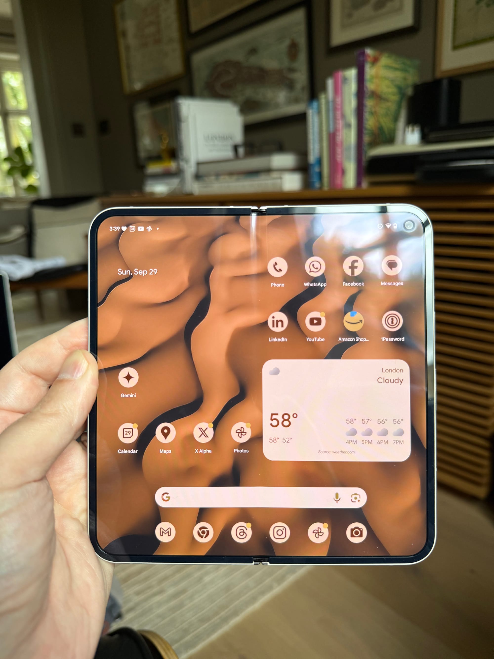
Technically, the 'Pixel 9 Pro Fold', but that's a silly name – nearly as ridiculous as the iPhone numerology at this point – I'm just going to call it the 'Pixel Fold' or the 'Fold' here.1 It's great. Is it better than the iPhone? I mean, look, at this point I don't think I'm ever going to switch from the iPhone. I'm simply too wedded to the ecosystem. But also, I don't really want to. It was and remains a brilliant device. Tedious transfers aside, better each year, even after all these years. But that doesn't mean my mind can't and shouldn't wander...
I actually bought the first generation of the Pixel Fold last year. I had been writing and thinking a lot about foldable phones – for years! – and the notion that Apple might one day move into the space. The early iterations by Samsung were sort of a joke. But they kept at it. And now, by most accounts, they're actually pretty good. I can't quite bring myself to use a Samsung device, but once Google moved into the market themselves with said Fold, I thought, "sure, why not?"
That first Fold was interesting. I love the concept of taking a regular-sized smartphone and unfolding it into something more akin to a tablet. And it worked well enough. But it also lacked any sort of polish. More importantly, it lacked a lot of updated software to make use of that dual-screen nature. It seemed very much like a first attempt at a foldable because it was. This next generation of the Pixel Fold is much, much better. Truly, a huge leap forward, at least hardware-wise.
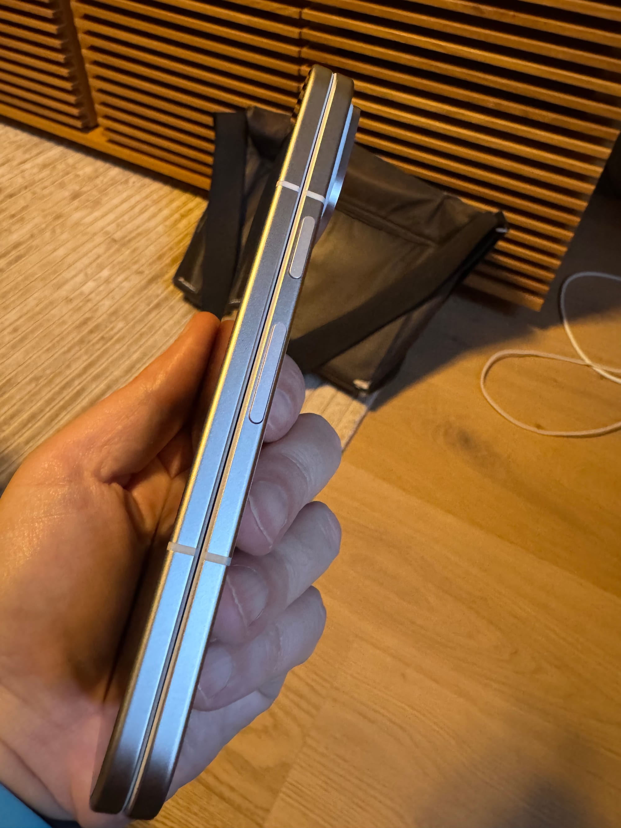
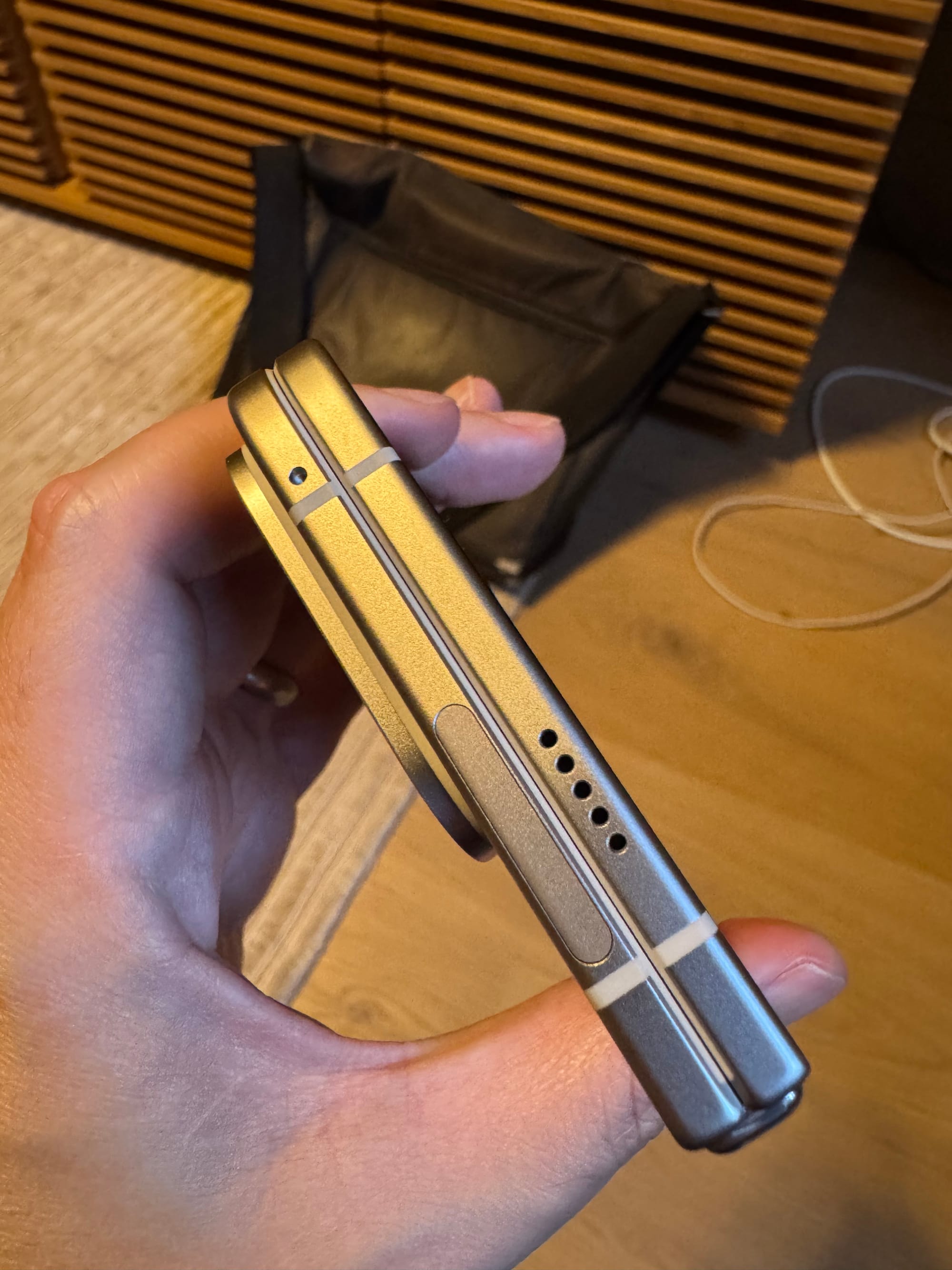
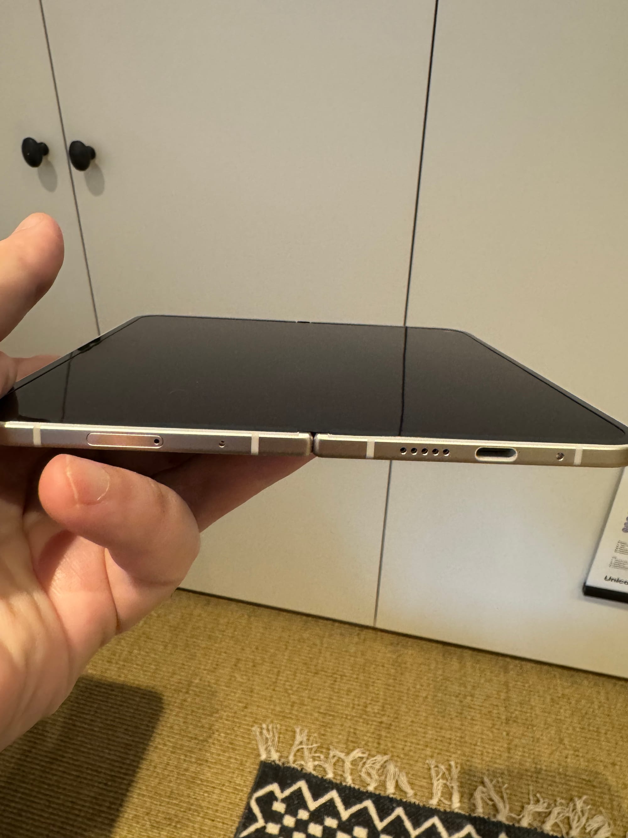
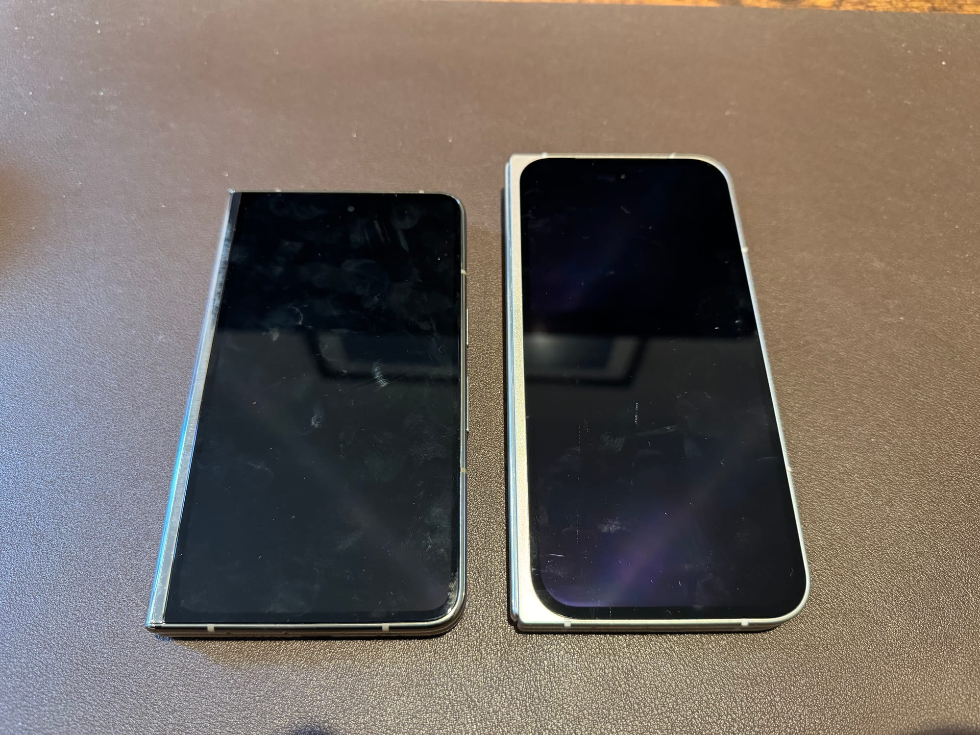
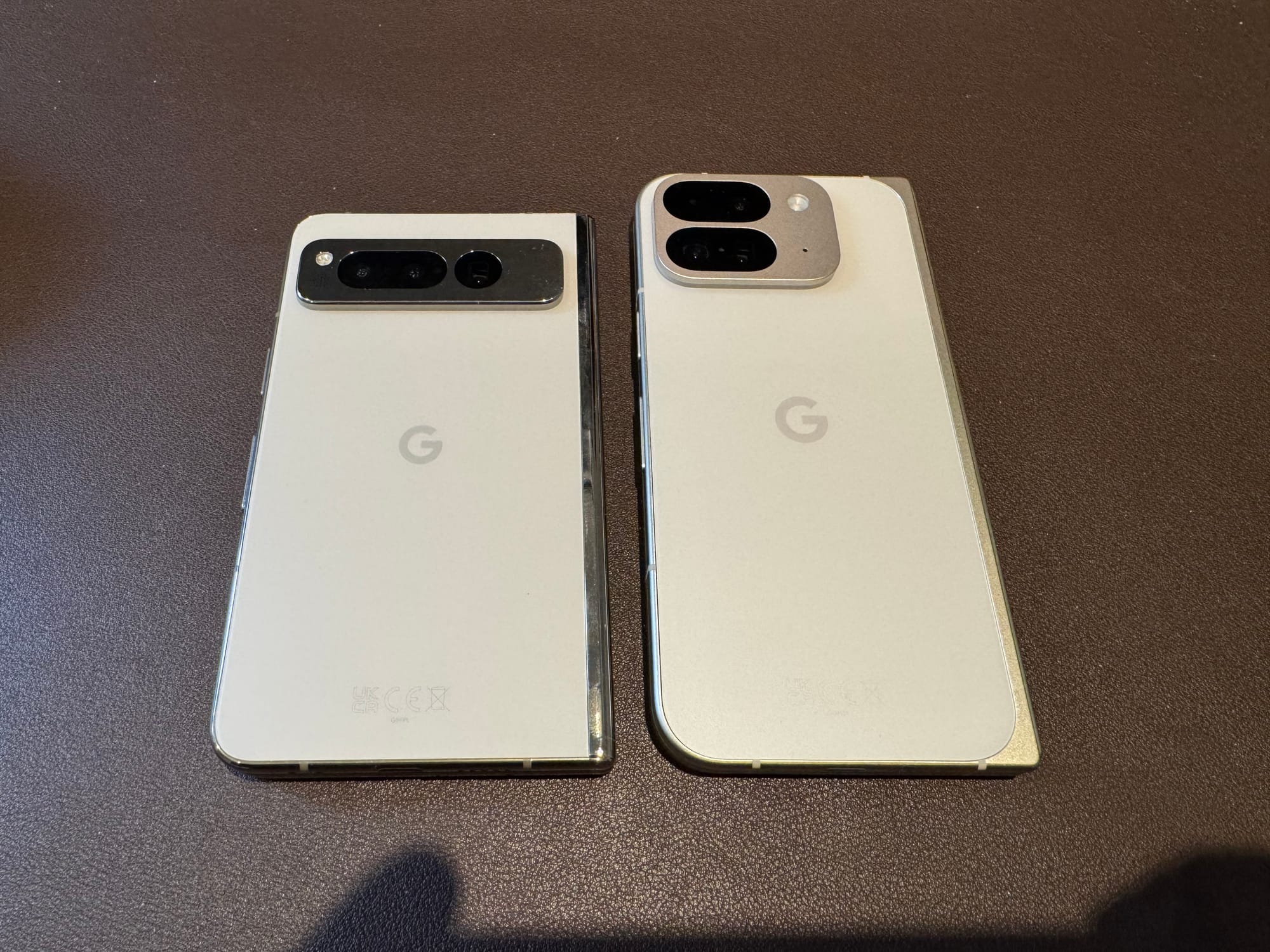
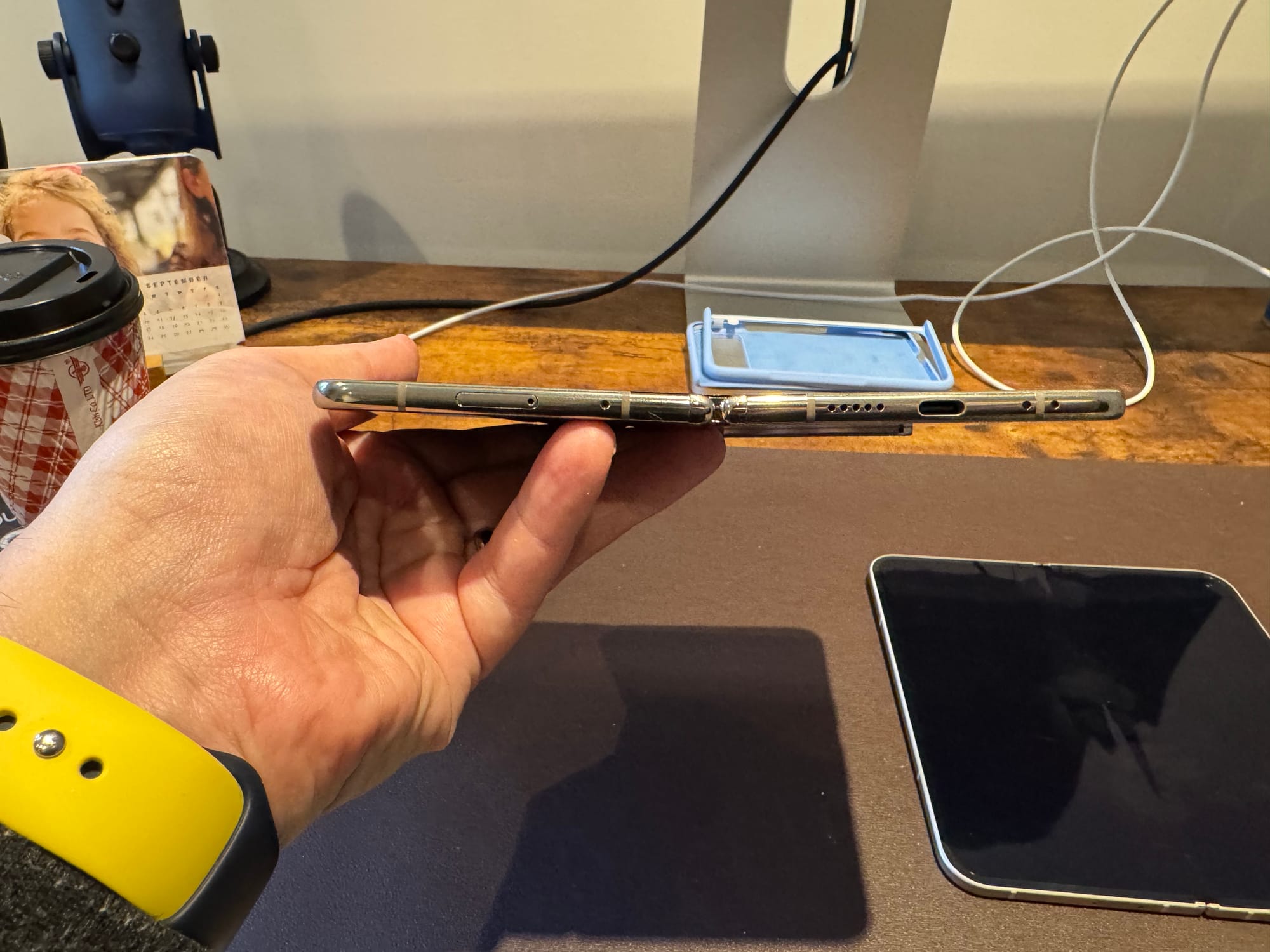
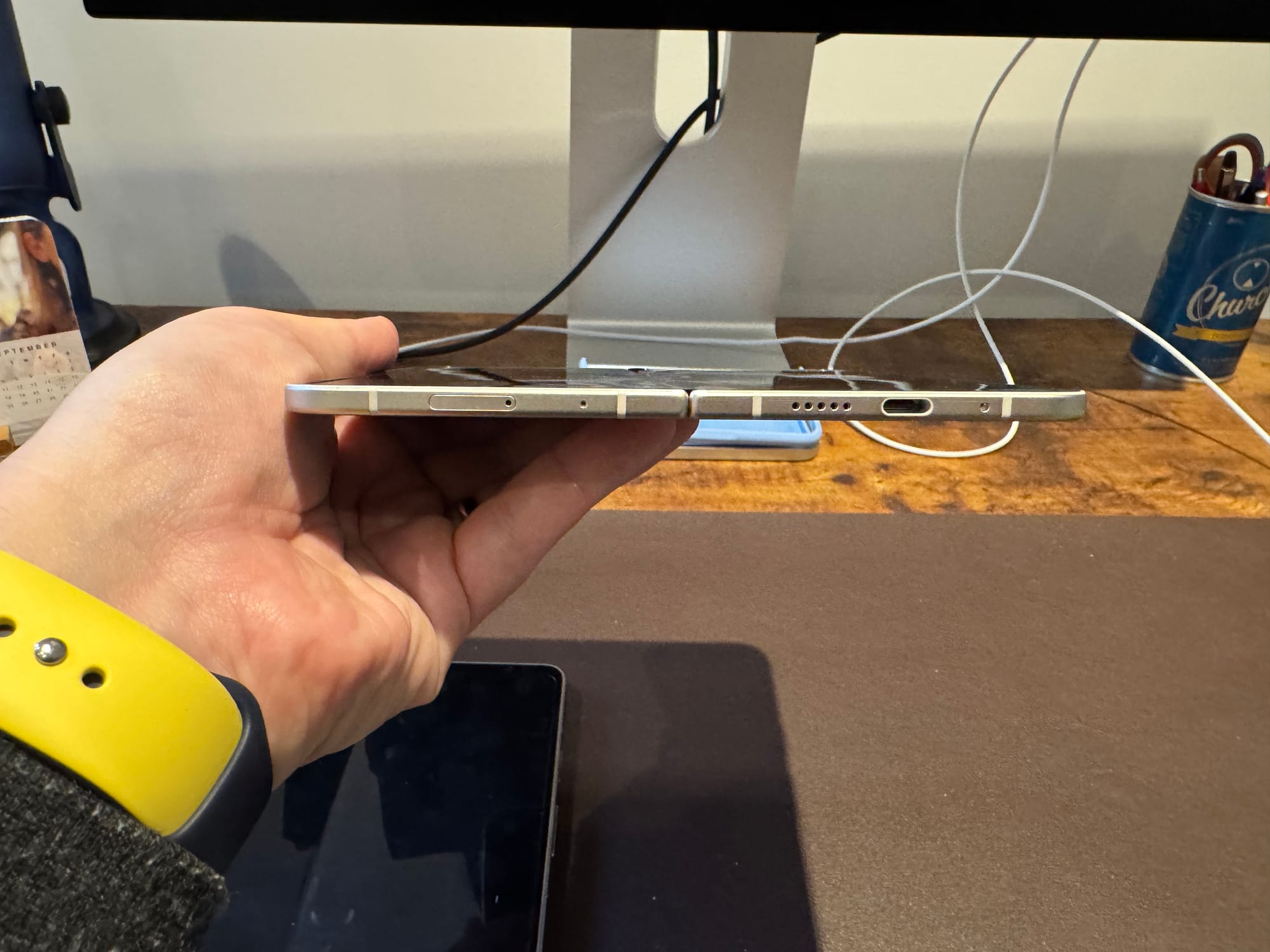
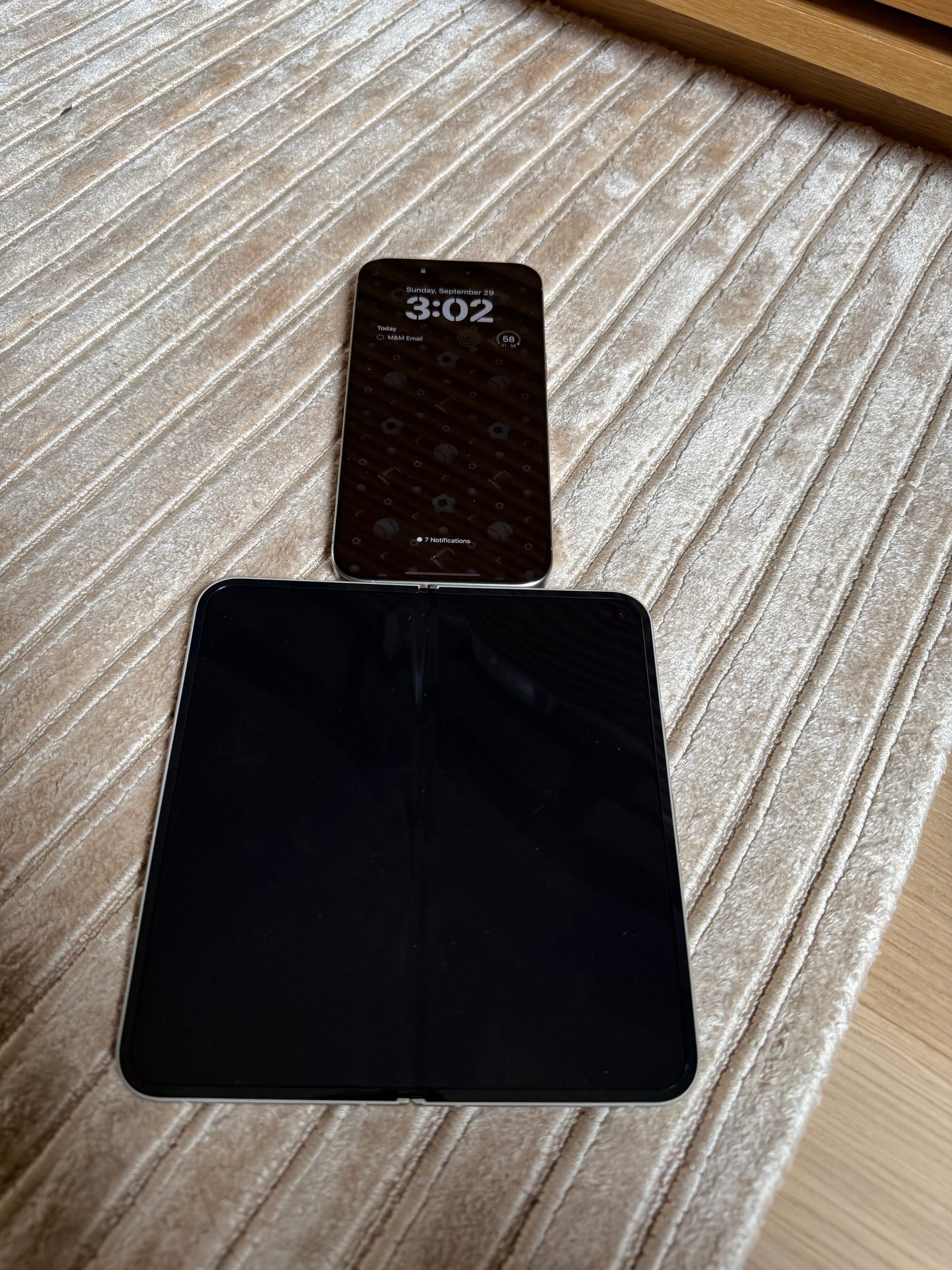
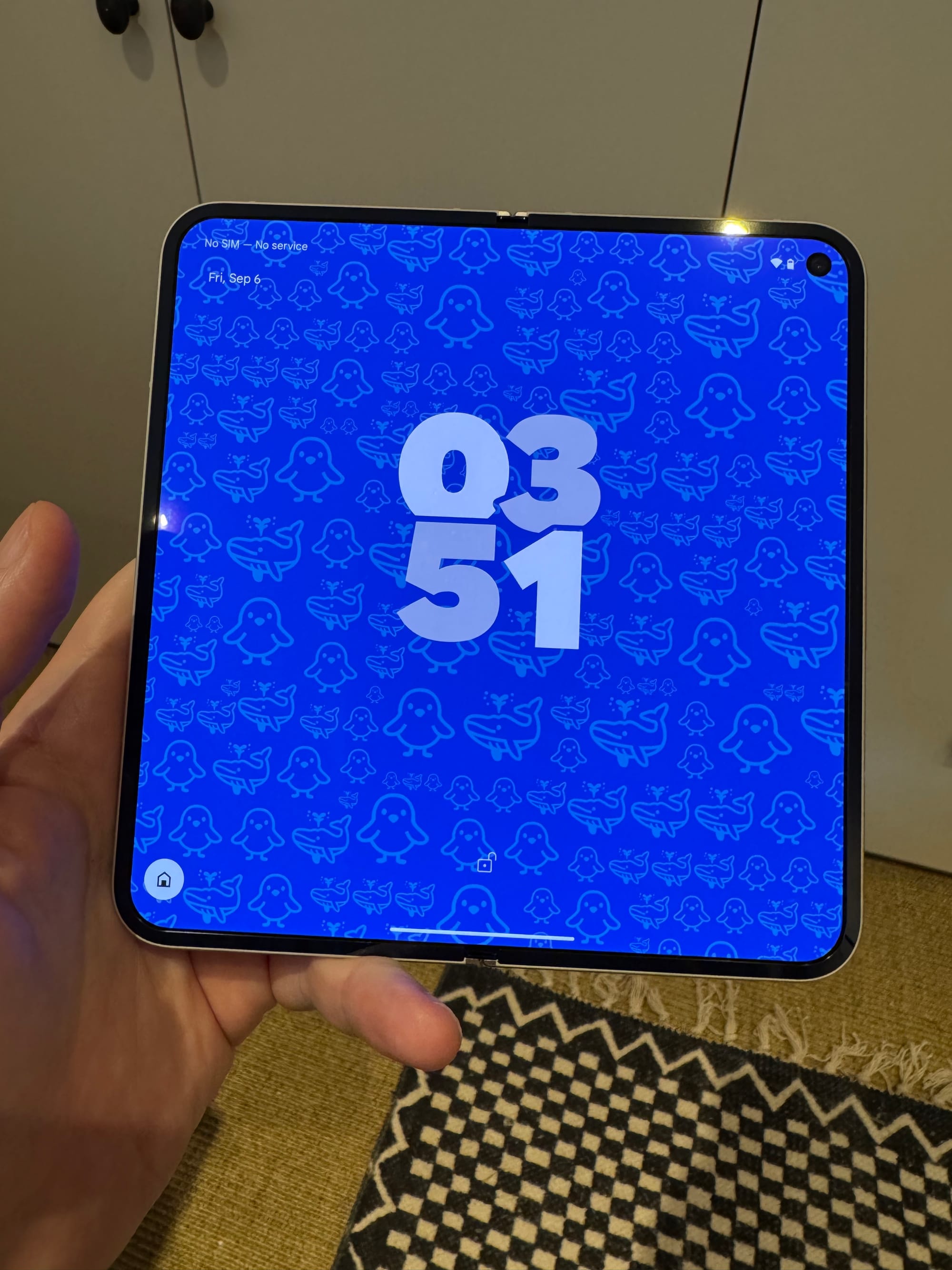
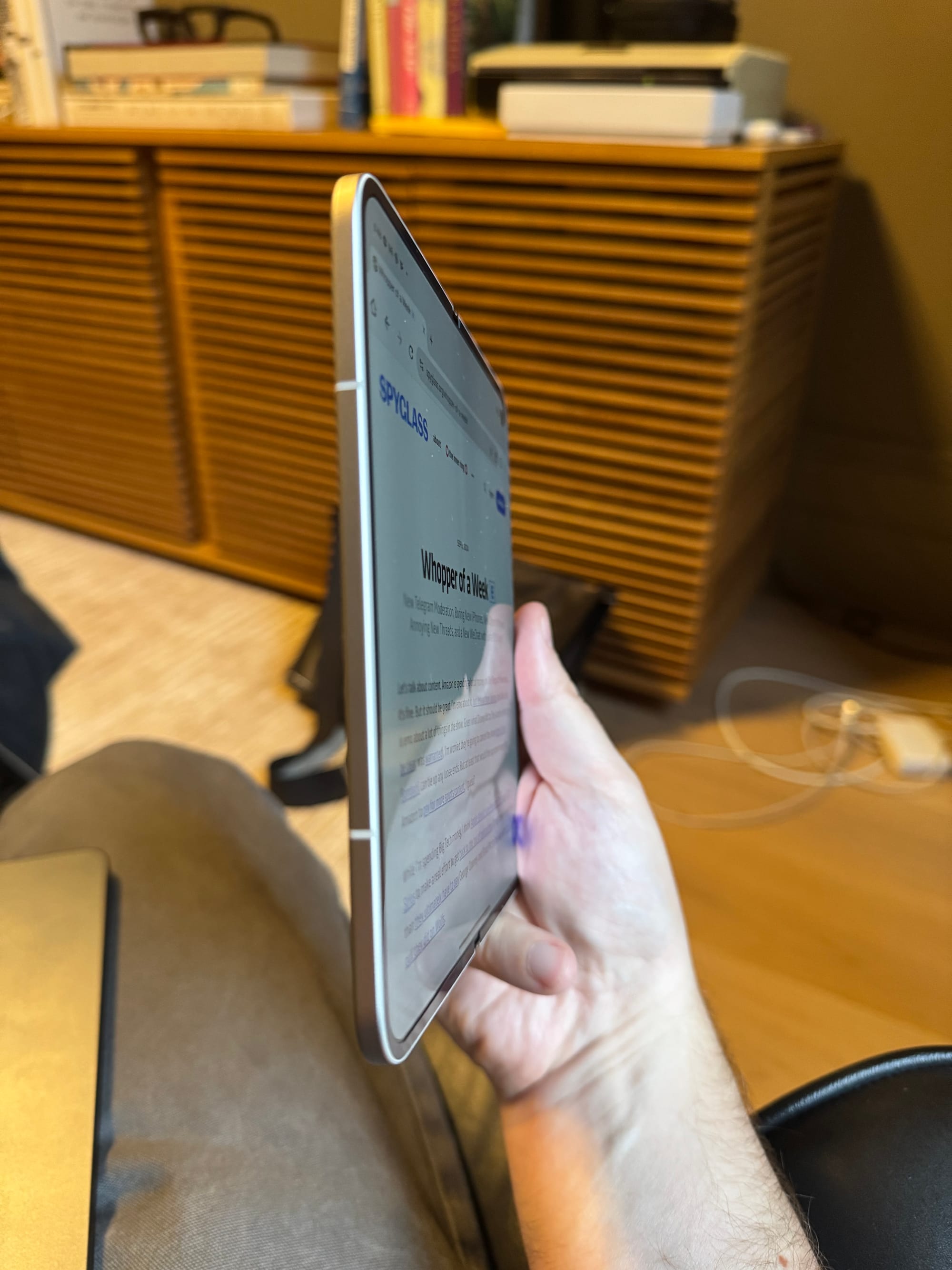
When you first open the packaging, it's presented to you as more of a tablet – a giant screen unfolded. That's interesting, but I suspect it's also practical: so that the device starts out without a crease where it would fold. It begins life as just a beautiful, svelte, almost square mini tablet. One element that drove me nuts about the first Fold: the back never went fully flush, and thus, not fully flat. It was weird. I kept thinking I should try to make it go flat, but each time I was terrified I would break it. It just was a bit janky in this regard. The Pixel 9 Pro Fold goes fully flush and fully flat. Very nice.
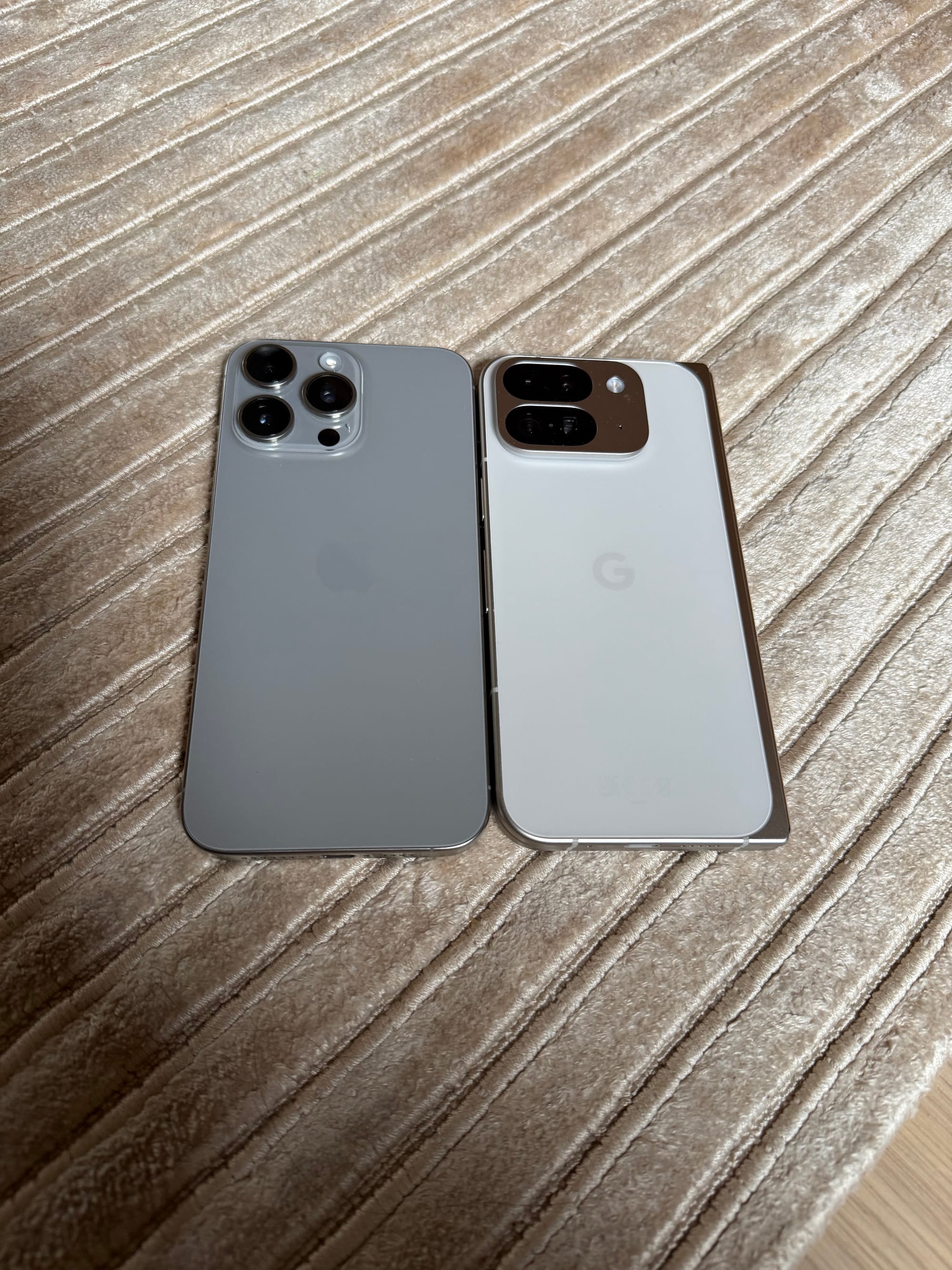
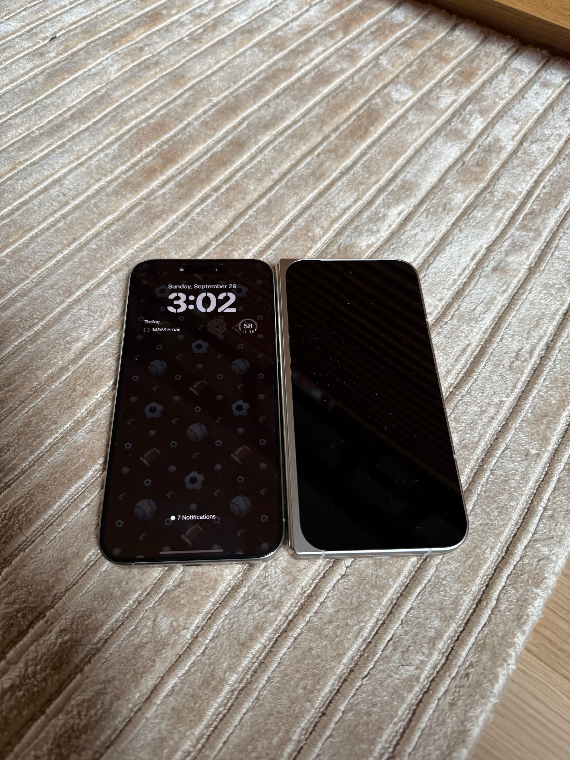
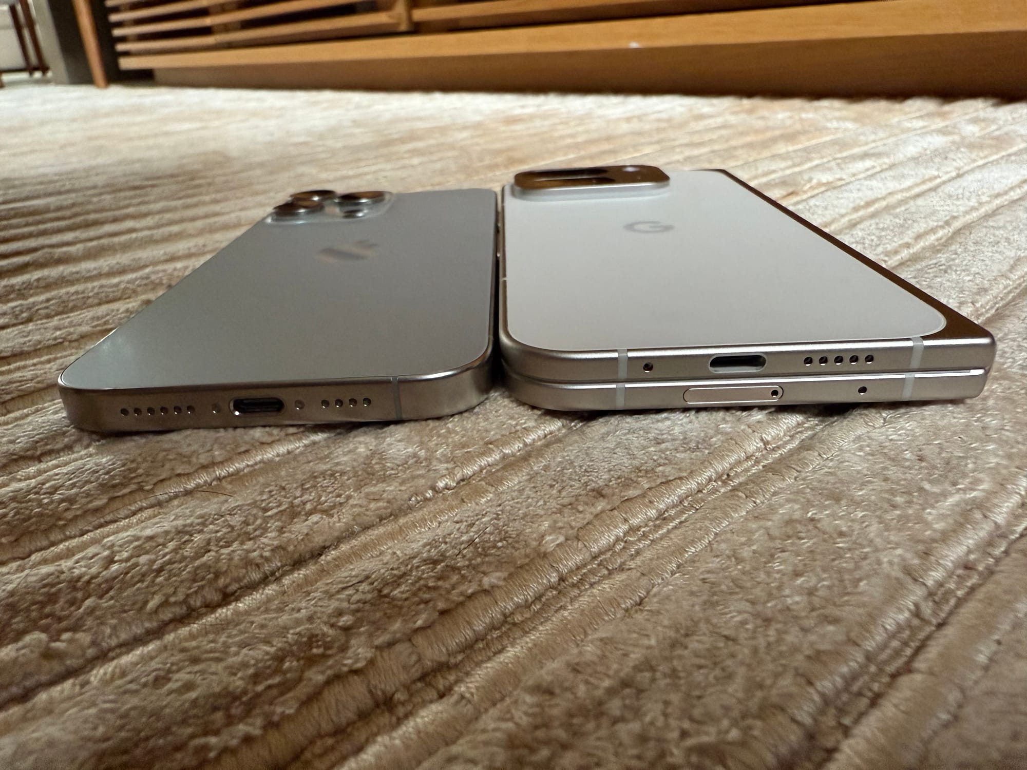
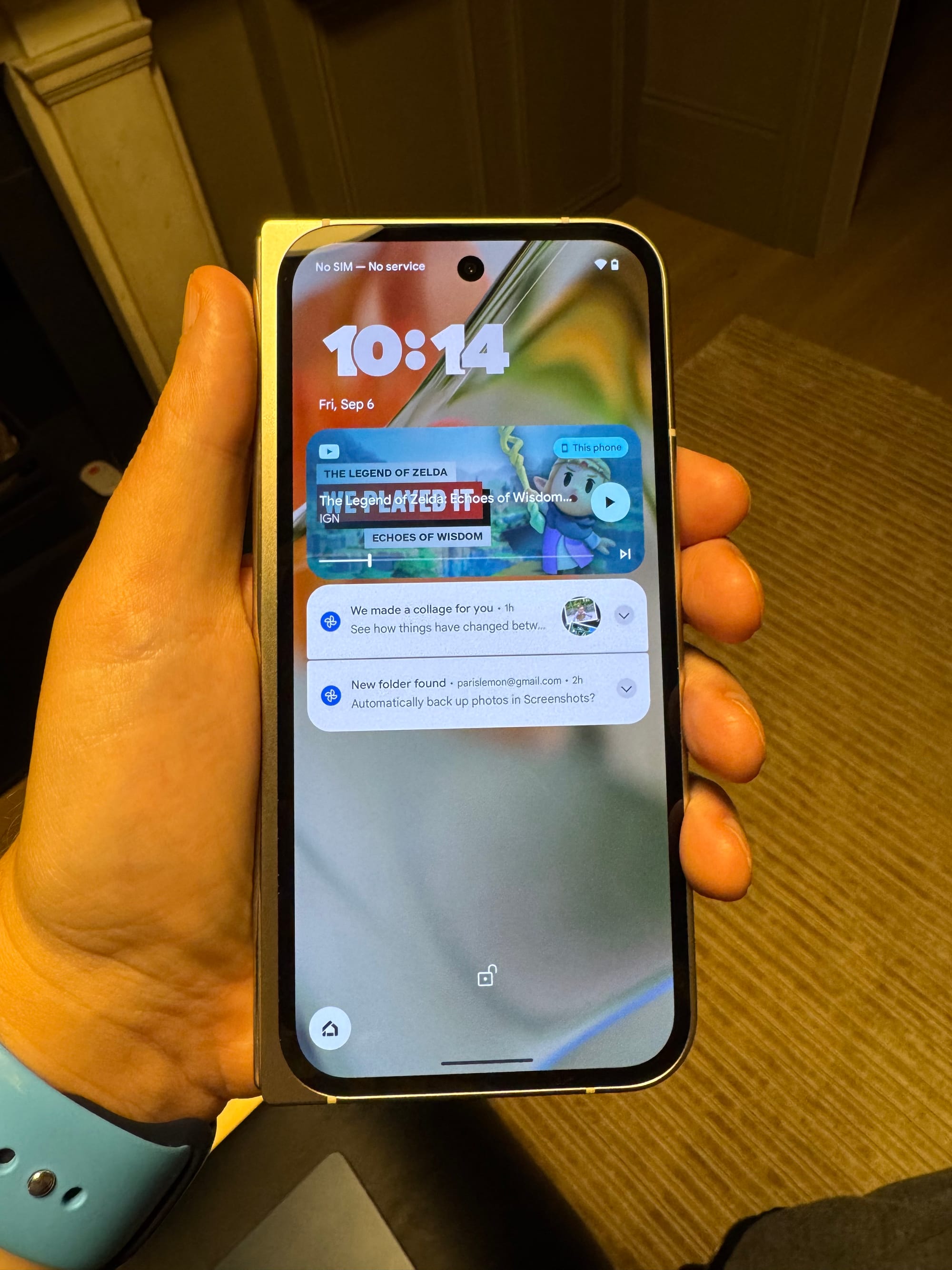
You fold it into that more standard smartphone and that's nice too. It's taller and narrower than the first Fold when folded. It's roughly the same size as an iPhone 15 Pro Max, but the screen is smaller because of the left-side mechanisms that allow it to fold and unfold. Again, such things looked a bit janky on the first Fold, but I think they look quite nice on the new Fold. That left side rail also gives you a nice, solid and large area to place your thumb (and partial palm), if you're holding it in your left hand. The right-side and top and bottom of the device feature two halves that are perfectly flush against one another when folded. Again, this is so much better than that first Fold.
Folding and unfolding the device is not exactly hard, but it's not entirely easy either. It takes a bit of effort, but nothing extraordinary. I find folding it a bit more awkward than unfolding as it leads me to push the screen inwards with some pressure, which just feels like something I shouldn't be doing. But again, it works fine.
Less fine is the crease. Whereas this Fold started life without one, as it turns out, when you fold and unfold the screen even just a few times, one forms. This is not exactly surprising, but it's still a bit disappointing. If I had to guess, this is the single biggest reason why Apple hasn't moved into this world yet. I can see it driving Apple engineers and designers crazy that they need to contend with a crease. But look, foldable things crease. That's the way it is. You either live with it, or come up with a more explicit dual-screen solution. It's a trade-off.
Personally, as with the "Dynamic Island", I have to imagine there's a clever way for Apple to "own" it. Turn the weakness into a strength, or a feature. But that's a hypothetical thought as currently, Apple has no such device. And apparently isn't all that close to having one. And even if and when they do move into the space, they may start first on the iPad side, rather than the iPhone side.
My quick gut reaction to this Pixel 9 Pro Fold mixed with the just-launched iPhone 16 Pro Max makes me think this is now a mistake. We'll see how the iPhone sales come in for these new devices, but I believe Apple may have messed up their timing here. If nothing else, it just sort of looks bad – quite literally – for Apple to have no answer for these foldables. Certainly in China! I mean, Huawei just said, "fuck everything, we're doing three folds".
Again, it's not in Apple's DNA to chase something just because others are doing it – see also: all the calls for Apple to do a "netbook" back in the day – they have to believe they can do it above and beyond better than anyone else. And with foldables, given the crease issue alone, I'm not sure that's the case right now.
Still, with each passing year, the iPhone looks more and more the same. Again, it's a great device – perhaps the best device ever created. But people like "new", people buy "new". If Apple cares about sales, which obviously they do, they need to embrace "new" at some point. A new button, as nice as it may be, isn't going to cut it.
Of course, next year will seemingly bring something "new" in the form of a thinner iPhone – an "iPhone Air" as it were. That will help as it will seem "new". But it will also be made fun of because as hard of an engineering challenge as it may be, presumably it also won't look all that different from the current iPhones. Certainly not from the front, the part of the phone you stare at all day, every day. It might be vain, but again, people care about such things.
And so I say again, I think Apple has made a miscalculation on foldables. Like large-screen smartphones before them, I suspect Apple will move into this world. But I think the mistake was in not doing it now – or next year, at the latest. Instead, we may be two or more years away. And again, a foldable iPad may come first.
Maybe that will be the right call from a product-perspective, but from a bottom-line perspective, there's the iPhone and then there's everything else. As the iPhone goes, so goes Apple. And while the company has done a great job (from a Wall Street perspective) raising ASPs over the years, that could be heading the other way this year. While there was some early hope for an "AI bump", Apple also didn't time that functionality well. Again, maybe it will help with next year's models. But you know what would really boost ASPs? A foldable iPhone.2
The Fold starts at $1,799 while a iPhone Pro Max starts at $1,199. It's not cheap. But beyond the screens, the Fold does have double the RAM of the iPhone – which could matter for all the promised AI workloads. Google also often seems to be discounting the Fold, for what it's worth (or less than it's worth, as it were).
Leave it to me to write some thoughts about the Pixel Fold and have them mostly be about the iPhone. You're welcome. But seriously, the Pixel 9 Pro Fold is a great piece of hardware. Software-wise, Android also feels more polished than it ever has – though again, I still prefer iOS.
Without question, the software is ahead when it comes to AI capabilities, which is the lowest bar possible since Apple's aren't available yet! But even in testing Apple Intelligence in beta, it's very rudimentary. Gemini Live, by comparison, feels like utter magic. I suspect Siri won't feel like magic for a long time. Maybe next year. But probably not. Apple probably needs an answer there too.
The UI customizations that Android offers are nicer than Apple's too. Even with the iOS 18 tweaks this year. Apple tints icons, Google actually tailors them. It's honestly pretty strange how much better Google's implementation is.
There are a few smaller nits – notably, the Fold doesn't feature an always-on screen. And I think I preferred the camera "bar" of the first Fold to this new, iPhone-like giant square bump. Overall, the device is obviously a bit thicker than an iPhone but probably way less than you'd imagine given this thing has 3x the screenage... Honestly, in the pocket – and even in hand – it's not that noticeably different than a Max iPhone.
More broadly, Google still needs more software tailored for the Fold. Their own apps work pretty well – notably, YouTube, which even has a UI for when the device is partially folded. But most other apps just expand to fill the larger screen when unfolded, when they could and should do so much more from a UI-perspective.3
In general, walking around with the Fold is pretty awesome because it does evoke the feeling that you're in the future – the future of Westworld. Not with the murderous AI robots – not yet – but more so with that awesome foldable tablet device. The Fold is the closest I've come to feeling like I've have one of those. But I also haven't held the Huawei tri-fold yet. Because I spent the $3,000 I had laying around on the Vision Pro.
1 For one thing, there's no non "Pro" fold. I get that they want to convey it's as powerful as the Pixel Pro line, but it's a clunky naming scheme now.
2 Which may, in fact, end up a "Flip iPhone" instead. But really, how much would Apple sell such an iPhone for? Starting at $1,800, like the Fold? $2,000, like most Apple mark-ups? A fully-loaded version would almost certainly and easily cross that threshold...
3 Apple will get that element right, eventually.
