My 2024 iPhone Homescreen

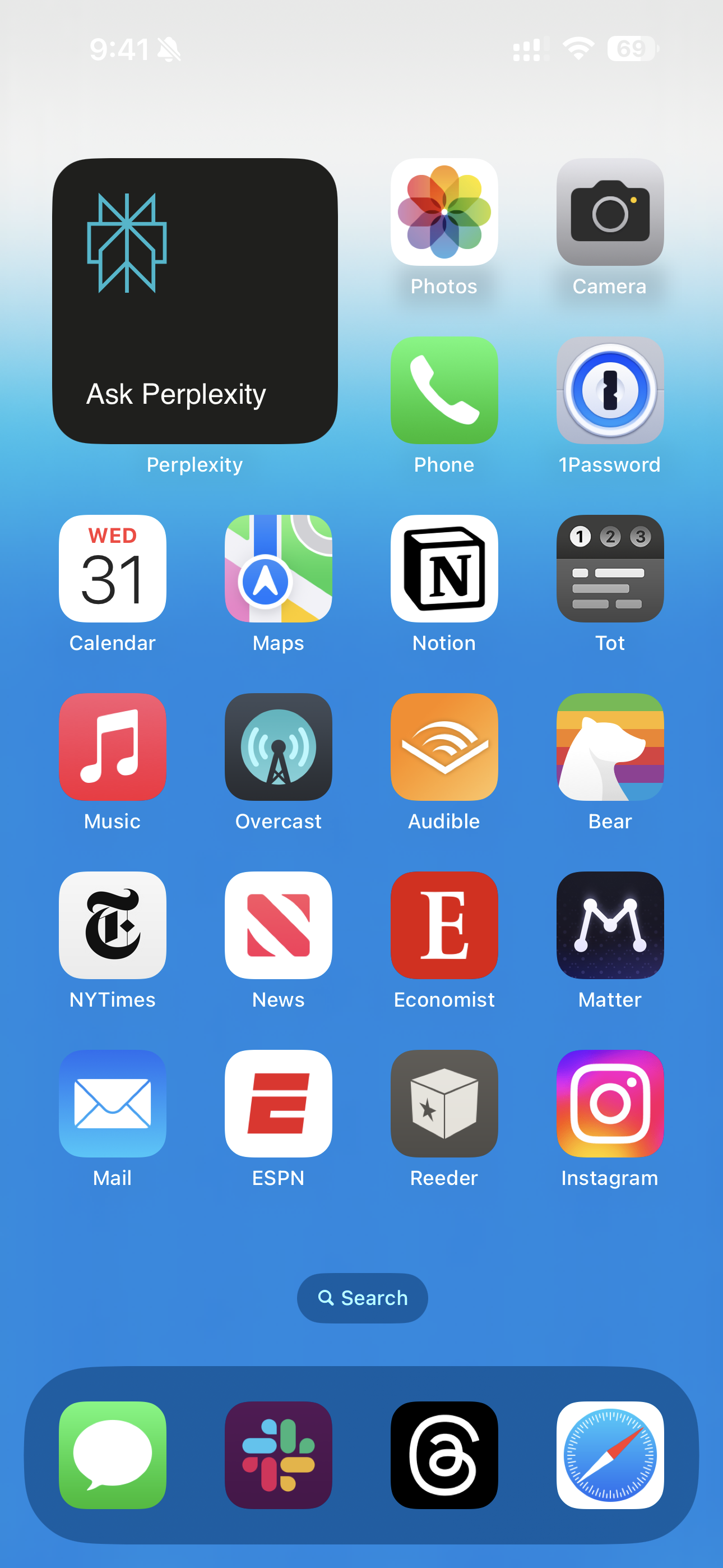
Historically, I've used the start of the new year to post a screenshot of the homescreen of my iPhone. Each year, I'm late in doing so. And each year, I get asked when it's coming. This year, I'm later than normal in doing so – sorry, I've been busy spinning up a new website – but I did want to put it out there while we're still in the first month of this new year, at least. I made it by a few hours. Phew.
Anyway, here is my iPhone homescreen as it stands right now, on January 31, 2024. As such, it seems a bit silly to call it "My 2023 Homescreen" (and really, that was a silly way to frame it anyway, since I obviously changed it multiple times throughout the course of 2023). So this is my iPhone home screen as we start – more or less – 2024. Here's what it looked like last year, and for 2021, 2020, 2019, 2018, 2017, 2016, 2015, 2014, and 2013 (fittingly, a decade ago, the last time I changed sites).
It's always fun to pull up these posts and to see a homescreen that I looked at for untold hours in yesteryears. A true time capsule. With many apps that have long since departed this world. Which is the perfect (and yet no less awful) segue into this year. Where not only did we lose an app, but we lost an app that has been in my dock for a decade: Twitter.
The move to Xitter and all the ridiculousness that has entailed has also meant a move off my homescreen. No, I haven't deleted the app as many have – I still view it as too vital for certain types of information gathering – but I don't use it anywhere near the volume that I used to. Often it had been my most-used app. Now I use Threads more. And so to the dock that app goes.
While that's obviously the biggest change versus last year, a few other shifts worth noting include Apple News getting a spot. This is a recent addition and honestly not one I was anticipating. But it took the place of a new app which lived and died in 2023: Artifact. Yes, I was one of the (apparently relative few) people using the app a ton to surface interesting content. Yes, this was also largely due to the death of Twitter. And yes, Artifact was seemingly getting worse over time after a strong start out of the gate (I have a number of thoughts on this topic, but that's probably another post). Anyway, when Artifact suddenly and surprisingly was killed off,1 in my moment of weakness, I turned to Apple News. It's not bad – and I do like the audio stories – it's just pretty generic.
Beyond that, the only other new app this year is another small startup you probably never have heard of: Instagram.2 This also seemed fitting given Artifact's demise, since the apps were created by the same founders. But the reality is that I brought Instagram back a while ago, probably around the time that Threads replaced Xitter. While I still think it's entirely too cluttered versus what it once was, it's still the social network my cohort uses the most.
So yes, a couple bits of drama aside, this is all quite boring. Sadly, such is the state of mobile apps. But wait. What's that in the upper left? Not an app, but a widget. Specifically, the Perplexity widget which lets you dive right into asking a question (versus the app itself, which just takes you to the main screen). I've been trying this out for various workflows. As well as the ChatGPT widget on my lockscreen (below). With these two plus the just-released Arc Search app, we're finally seeing something new. Because could it really be a post about 2023/2024 without any mention of AI?
No, no it could not.
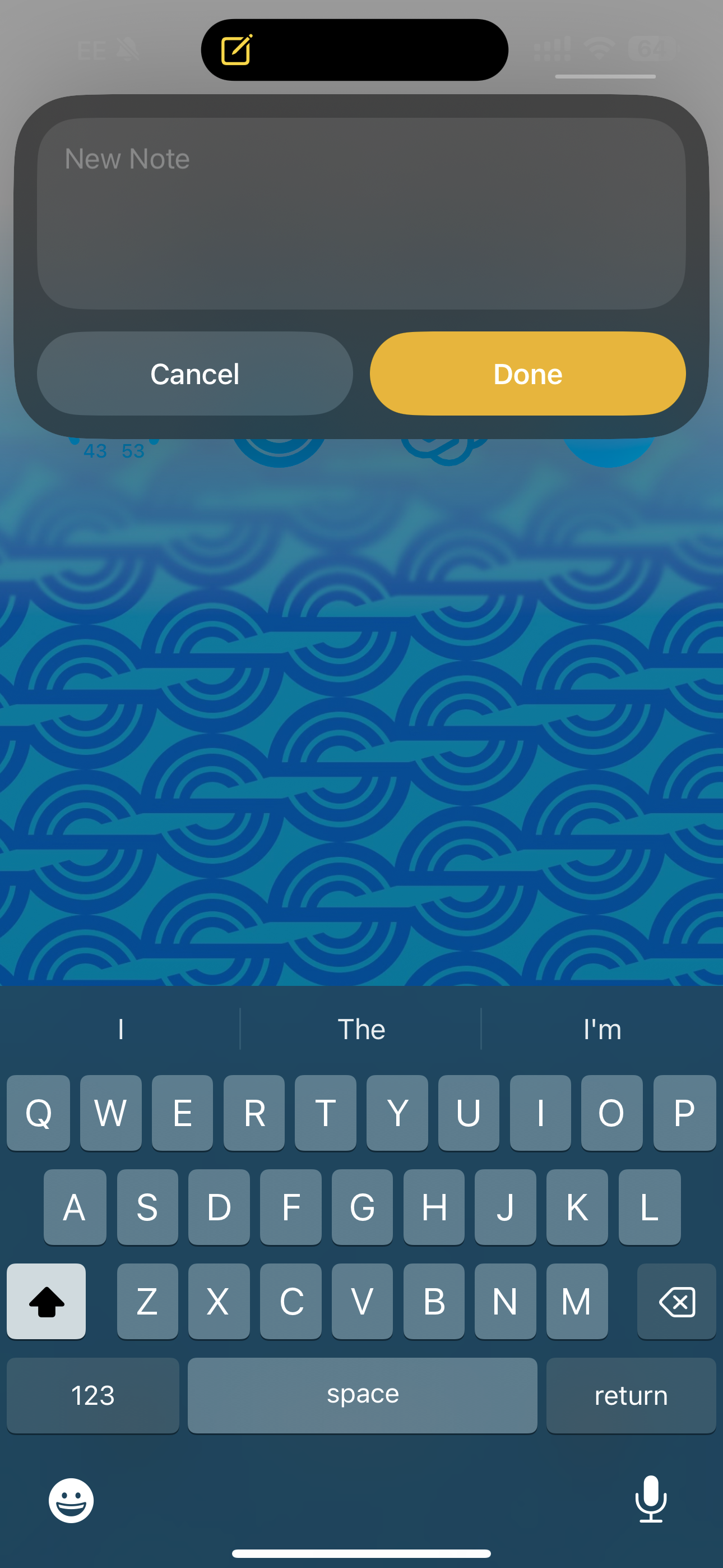
One more thing: while not a homescreen app (or widget), the addition of the Action Button to the iPhone 15 Pro this year did add a new way to call upon a service without having to hit an icon on the screen. At first, I was using this to invoke the camera app. But it's actually quite poorly placed for that (and why, I suspect, it's rumored that we'll see yet another new physical button just for the camera with better placement next year). So I've been rotating through some other apps/functions for the button. Right now, I have it set to take a quick note in the Notes app. I usually don't use the Notes app for this purpose, but the overlay widget Apple built for this (versus opening up the entire app) is very nice.


1 Yes, it still technically works, but it's being killed off in a few weeks completely. And I saw no point in continuing to use a dead man walking app.
2 To be fair, I did know it when it was a small startup you had never heard of.
