The Impressively Infuriating M4 iPad Pro

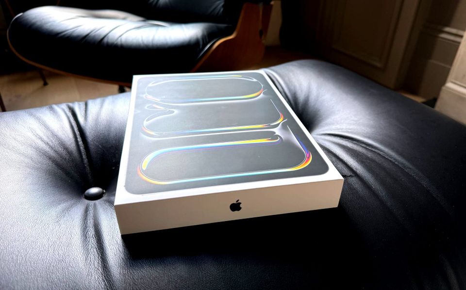
I’ve been using the new M4-powered iPad Pro for a few weeks now, and before the tidal wave of WWDC news fully slams into us next week, I wanted to get some thoughts down.
First and foremost, it’s a beautiful device. Truly. If it’s not the best-looking piece of machinery Apple has ever made, it’s close. The marketing hype is real, it’s impossibly thin. After all these weeks I still feel the need to twist it in my hands to get a glance at its profile. It's like the A Star is Born scene over here constantly. Not only do I recall laptops that were closer to 10 pounds than 1 pound, I vividly recall years and years spent staring into a nearly 50-pound CRT monitor on my desk. I can hold this insanely powerful computer in one hand, comfortably. It really is incredible. Full stop.
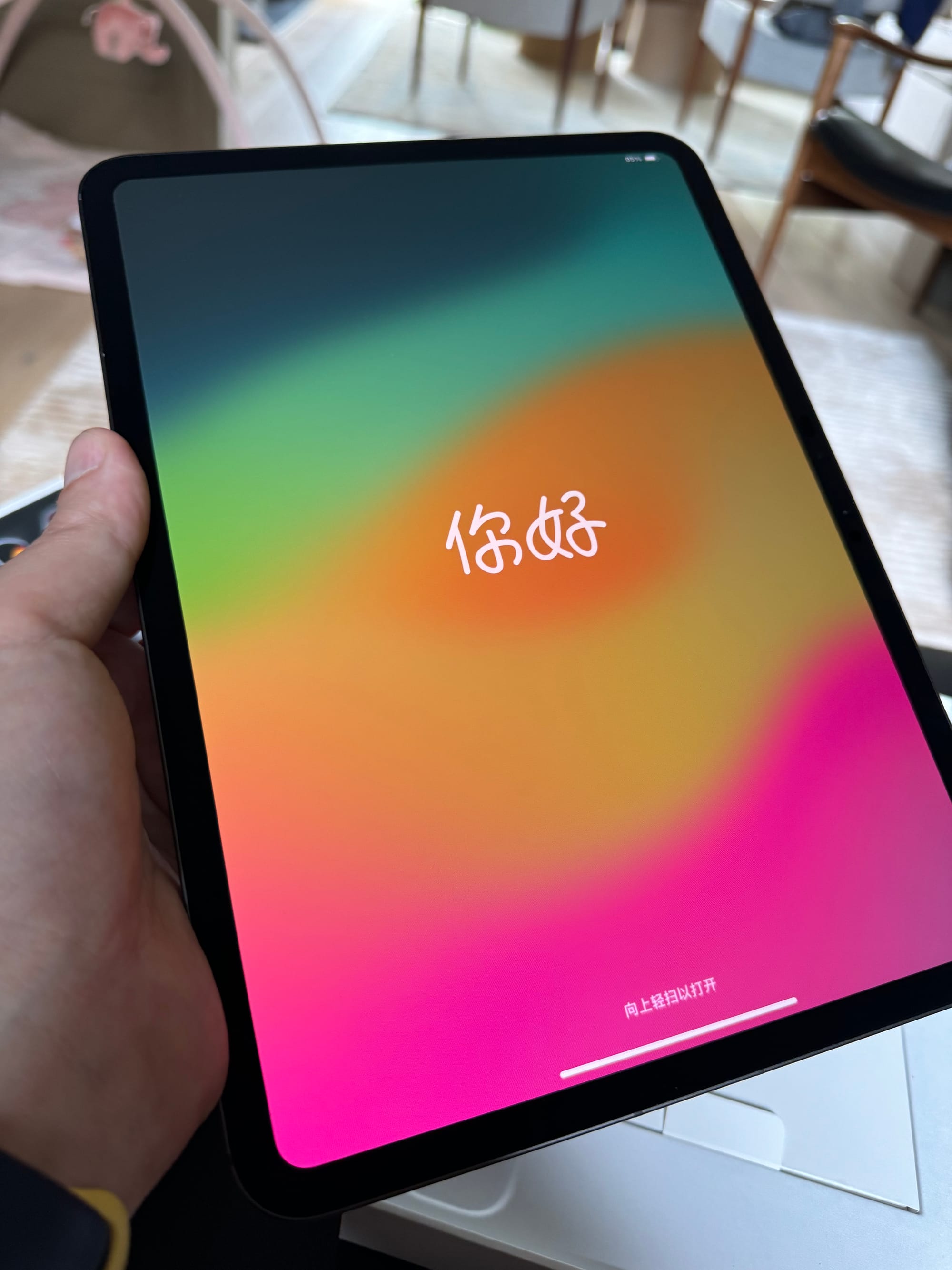
As is this screen. OLED is the real deal. This is most evident when it using side-by-side with the last generation iPad Pro, if you have the 11-inch model (as I do), which didn’t even have the mini-LED upgrade, just good old LCD. Both versions get the best "Tandem" OLED here. And blacks are now beyond black. You also notice how great the screen is if you plug it in to an external monitor. Even the Apple Studio Display doesn’t hold a candle to this screen. My god, it's full of nits.
I honestly have a hard time telling how fast the device is because I had a hard time telling how fast the M2 iPad Pro was. I simply don’t do the kind of tasks that would tax it on this device. Part of this is on me, but part of this is on Apple. If I could say, run macOS on this thing, I could more easily report back on its impressive speed. Oh boy, here it comes...
Come on, Apple. You have this power. Use it.
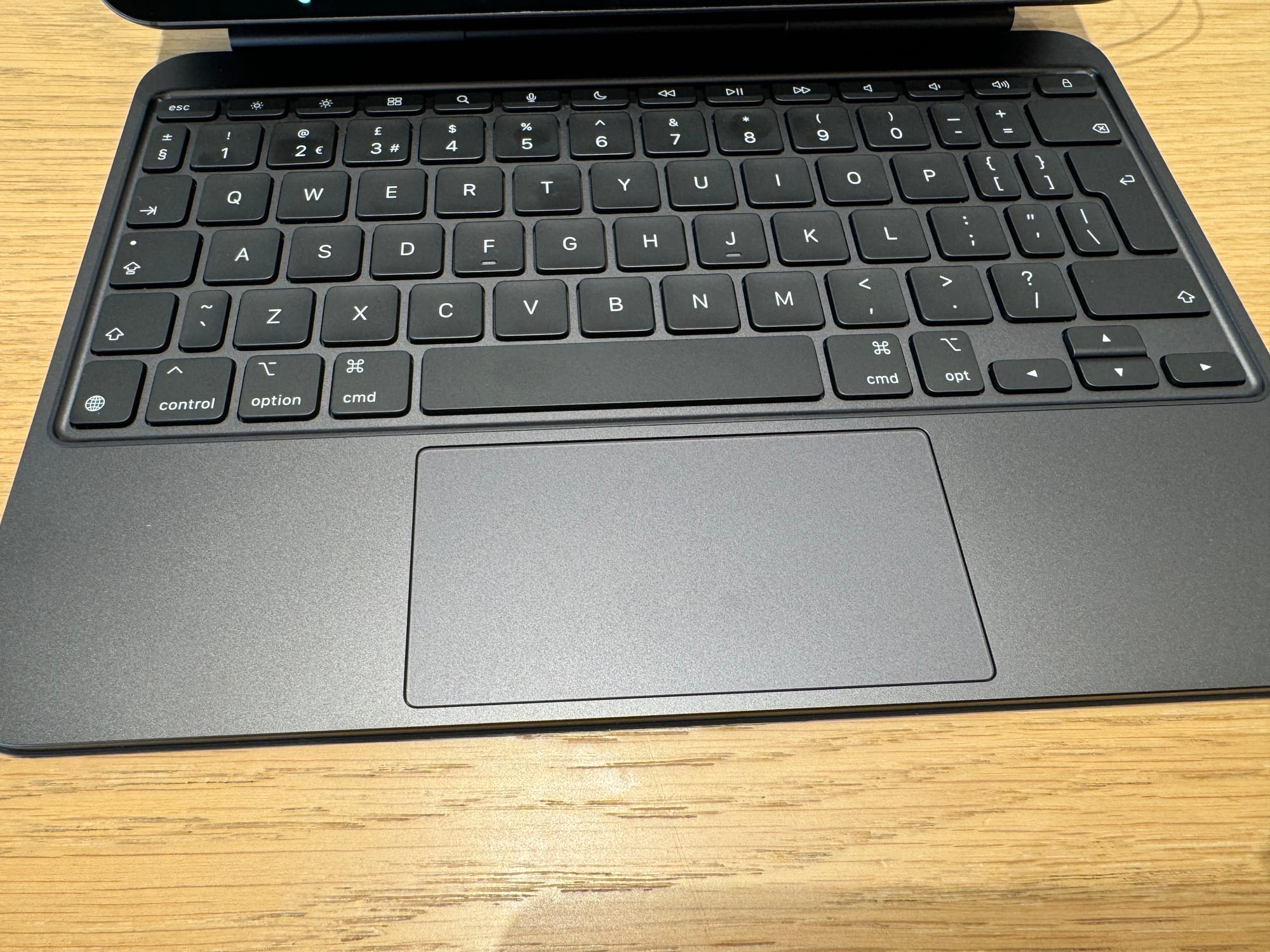
The other big winning element of the upgrade is the new Magic Keyboard. The keyboard itself is solid, but it’s the trackpad upgrade that makes a huge difference here. The old version of the iPad Magic Keyboard had a trackpad that was both too small and required a manual click. Even the slight bump in size and the move to haptic clicks makes a big difference here. Yes, it feels like using a MacBook.1

Albeit a MacBook with an OS that’s incredibly frustrating to multitask with. Mark Gurman blamed the screen size in his column the other day. And while I do think there’s something to that as when I hook up this device to my 27” Studio Display mentioned above, I do have a lot more flexibility to do more. But that’s because iPadOS doesn’t handle windowing very well and a larger screen makes it so you don’t need windows to overlap as much as you do on say, an 11” screen, obviously.2
Right now, I’m typing this on the 11” Pro with Ulysses open to write, Bear open to go over my notes, and Apple Music open, all on the same screen. It’s fine, but I can only really see Ulysses, the others just exist as slivers of UI to be able to quickly move to them for reference or to take a quick action like switching a song. Yes, I could do this via Stage Manager but I still don’t like Stage Manager. I’ve tried, I really have, to use it for years. I turned it off completely on my Macs. I have it on still on the iPad but really just so I can have these overlapping windows. If they’re not going to allow us to run macOS on this machine, they really need to rethink multitasking from Stage Manager on up. It’s just not good enough. Not nearly.
It’s interesting to think of this machine as an 11” MacBook. I’m someone who both used to use an 11” MacBook Air when Apple made them and loved the 12” MacBook when Apple made those. The issue with those devices was Intel. Both would run so hot and slow with battery life that was so pathetically short that they just weren't great machines, despite the awesome portability. The iPad corrects all of these issues, of course. The trade-off is, well, iPadOS.
ARE YOU SENSING A THEME HERE?
The one element I still don’t love about the Magic Keyboard is the back and front of it. It’s the same weird, rubbery material that it was previously. Last go around I had the white one which was way too easy to get dirty. Now I opted for the black one which still scuffs quite easily, even though I’m someone who very much takes care of my machines.
And with the new aluminum keyboard it looks and feels more like this rubbery stuff is just glued on (which I assume it is). There’s a small lip that jets out all around the perimeter and it bends. It just doesn’t feel very premium for a $300 add-on. It’s better than the FineWoven fabric would be, but just barely. Can’t Apple just, I don’t know, do the entire thing in aluminum? I’m guessing they don’t because it might add a bit more weight. Maybe it would mess with some of the internals? I don’t know, but I do know it would certainly look and feel a lot better.
I do find this version of the Magic Keyboard ever-so-slightly harder to open. That could just be because it’s brand new versus the last model which was worn in over two years. Or maybe it has stronger magnets with the aluminum case. Interestingly enough, it’s easier to open when it is laying flat and you use one hand to lift the screen as if you would a MacBook lid. The thing impressively stays flat on the surface it’s sitting on. I also find it ever-so-slightly harder to pull the iPad itself off the dock when open. Again, it may just be newer, or it may be stronger/different magnets. Regardless, it’s a small thing.
Having function keys, as it turns out, is great. But Apple should have known that years ago, as plenty of third-party iPad keyboards have had them for years.
Look, Apple may have created the single greatest piece of computer hardware ever made in this iPad Pro. But that just makes it all the more infuriating that we are forced to use iPadOS on it, always. That OS is very good for certain things, namely single-purpose tasks such as reading or watching content. But the whole just doesn’t add up when you simply must sum those parts. That’s why I still just want an option to run macOS if and when I need to be fully productive. That doesn’t feel like a lot to ask of a device approaching $2,000.3 And a device that can not only run such an OS, but could run it faster than almost all MacBooks.
This device could be the 11” MacBook Air done right. Or the 12” MacBook reborn with immense power. As an 11” iPad, it’s sheer overkill. Impressive yet infuriating.

1 I still find myself wondering if I shouldn't have gotten the 13" iPad Pro this time around simply to have an even larger trackpad. Again, the one on the Magic Keyboard for the 11" is a nice upgrade, but I still run out of real estate when trying to select text. That said, I also love the portability of the 11" screen. I'm torn...
2 Speaking of screen real estate, I don't know why I wasn't using the "More Space" option before -- I'm not sure it popped up the option to switch to this when setting up the iPad before? -- but yes, this is also *much* better. Assuming your eyesight can handle it. Thank you, glasses.
3 I'll settle for the macOS version of Safari, I guess.
