In the Annals of MLB Cap History
Damnit, I was all set to do a quick post making fun of Major League Baseball's new "Overlap" hats from a pure design/branding perspective – one of my favorite side hustles here – when an actual controversy beat me to it. Per ESPN:
A hat has been pulled from the Texas Rangers and Major League Baseball online stores after it was discovered that a mashup of the team's cap and jersey logos created the appearance of a vulgar word in Spanish.
The hat, which is part of New Era's Overlap 5950 collection, has the Rangers' block "T" that appears on the team's caps superimposed over the middle "X" in the block "Texas" logo that usually appears on the front of the team's jerseys.
By doing so, the mashup of the logos created a visual of a vulgar Spanish word used for women's breasts.
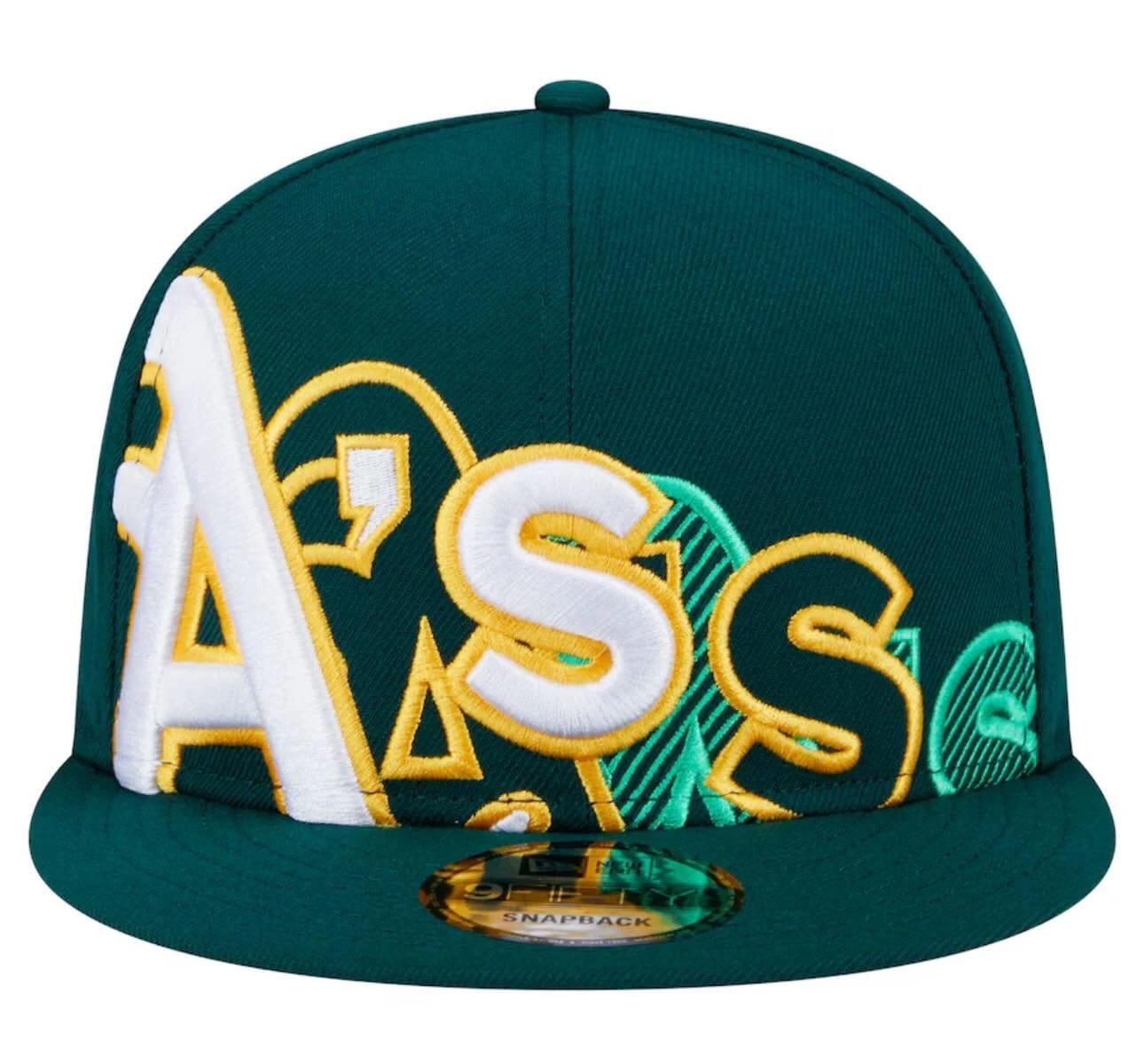
Just when you thought nothing could ever possibly top the literal "Ass" hat, in walks Texas, hold my beer-style.
It's truly amazing how bad baseball is at this. On one hand, you sort of get it because it's the American sport most rooted in tradition and history, and so any sort of change is going to be ridiculed, as has been the case with many – but not all – of the "City Connect" jerseys. But this is just next-level bad. I mean, in many cases they're inserting a letter in the middle of a name, thus changing the word.
If design is how it works, this is a total fail.
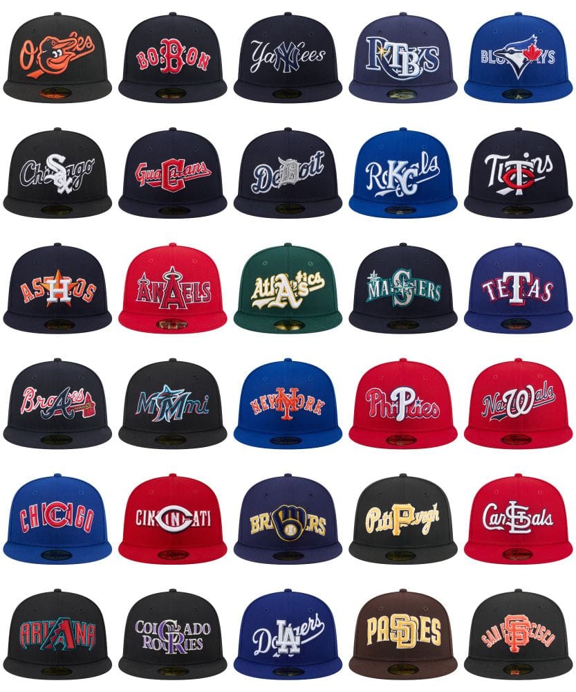
Vulgarities aside, we now have the "Ariana" Diamondbacks, the Seattle "Masers", the Atlanta "Braaes", the "Dedoit" Tigers, The Kansas City "Rkcls", the "Mmmi "Marlins, the "Pitprgh" Pirates, the Philadelphia "Phipies", the Washington "Nawals", the San Diego "Pasdes", the "Bobon" Red Sox, the Los Angeles "Dlaers", my hometown Cleveland "Guacans". Meanwhile, the Houston "Ashos" and Los Angeles "Anaels" (of Anaheim) also veer awfully close to vulgarity!
And those are the ones which are comically legible. The rest just look like jumbled up nonsense. (Though shout-out to the Chicago Cubs, which very nearly got them to replace "Chicago" with... "Chicago".)
My two favorite might be the Baltimore Orioles (as it just looks like their goofy bird mascot is trolling everyone given the smirk) and the Toronto Blue Jays (as it just looks like their very serious bird is just kind of a hog-the-spotlight annoying jerk).