OpenAI Debates Being All About the 'O'

How well covered is OpenAI at this point? Well, to the point that we're getting leaks (and scoops) about would-be new logos:
In a recent company-wide meeting, staffers of OpenAI got a sneak peak at recent efforts to redesign the typefaces and logo for the company behind ChatGPT and the ongoing tech industry craze for all things generative AI, two people familiar with the company told Fortune. The new logo presented was a simple, large black “O,” easily interpreted as a ring or a zero, as one of the sources described it. Many members of staff were taken aback by the design, which struck some as ominous and lacking in creativity. A few openly voiced their dislike for it during the meeting.
The proposed new logo is an aesthetic shift from the company’s current hexagonal flower symbol, originally conceived by designer Ben Barry as one evoking “precision, potential and optimism.” Given the staff’s strong response and some internal attachment to the current logo, which adorns OpenAI’s website and corporate swag such as the t-shirts and stickers beloved by employees, one of the people familiar with matter speculated that the design of the new logo could change again.
I love the notion that a couple of OpenAI employees leaked this to Fortune to stop a would-be rebrand. We're in deep, folks.
Sadly, Fortune doesn't give us a mock-up of what the new logo could look like, but from the description, you probably get the idea. It's all about the 'O', as it were. A very simple, likely black 'O'. So simple, one presumes, that it's yielding strong opinions. Is it too simple? Too deadly?
Look, I like the current OpenAI logo. Hell, it's on my lockscreen! It's a bit ouroboros – which is interesting for a few reasons – but it's distinctive enough now that if you saw it, and you worked in tech or even just tangential to tech, you likely know what it is. It's hard to throw that away. Yet as the article notes, many tech companies rebrand – many do so multiples times. Designers gonna design. Here, I'm perhaps most reminded of when 'UberCab' shifted to 'Uber' and the logo became a sort of a yes, ominous 'U'.1 But I digress...2 Back to OpenAI:
The redesign work began about a year ago, one of the people familiar said, around the time OpenAI built out its internal creative and design team with several new hires from creative agencies and fields like graphic design. Part of the impetus for the work is that OpenAI does not own the typefaces it uses for its brand name and website text – they are licensed typefaces created and owned by outside type designers.
The typeface element makes sense. I'm not sure they need to change the logo because of that (as it is bespoke), but if they were going to change the logo, doing so when "refreshing" the whole brand makes sense.3 And yes, as Hayes notes, if such a shift happens next year, it could also coincide nicely (or not) with a larger shift at the company: from a non-profit to a for-profit...
Anyway, we're probably way too far into the weeds with the company at this point. But since we're here, why not use OpenAI to come up with some mocks?
O... bviously.
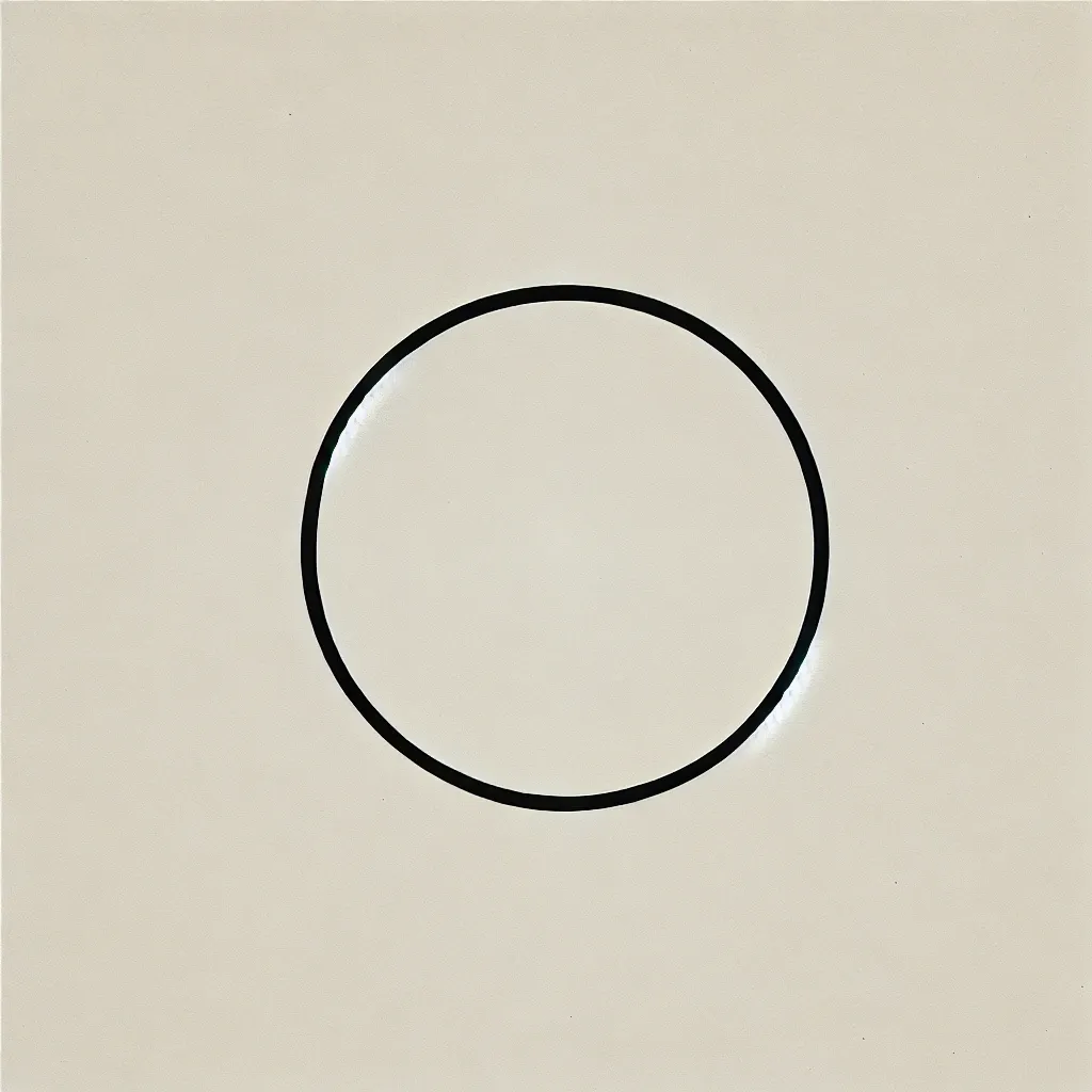
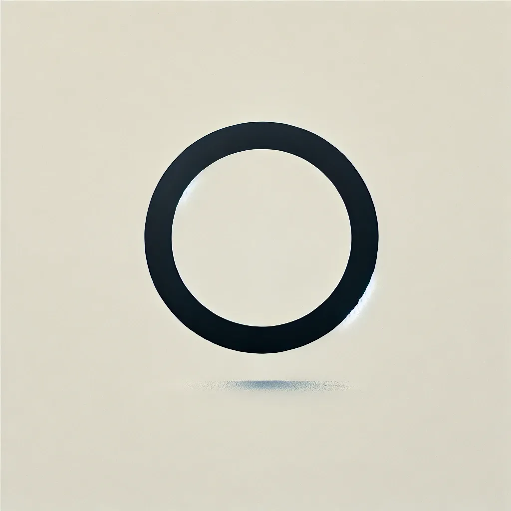
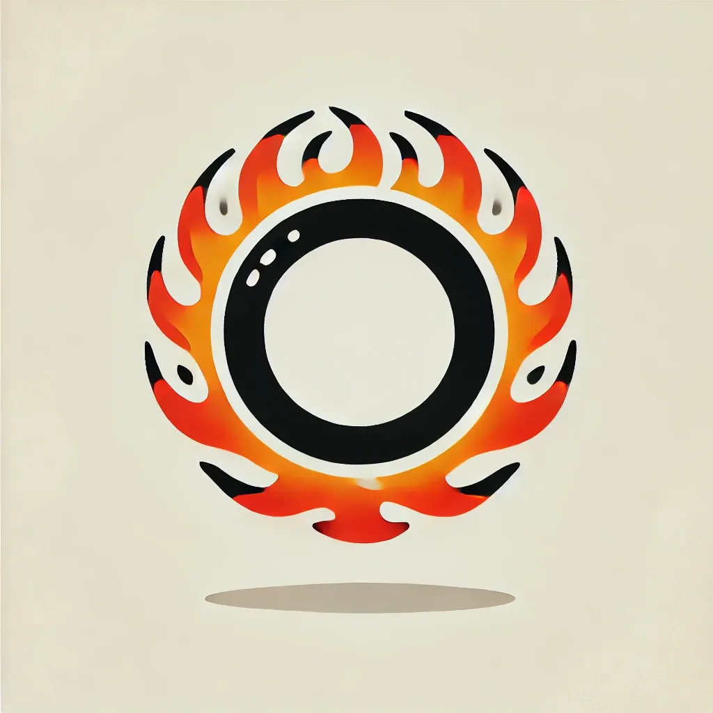
Here's what ChatGPT gave me...
1 Not to be confused when the 'U' shifted to a... well, "likened to an 'asshole'" – though the current OpenAI logo... just saying...
2 I was there, Gandalf. 14 years ago, I was there. On the steps of Mount Cease & Desist, I was there...
3 It might also play nicely with that they were going for with the 'o1' name they chose for their latest model (not to mention GPT-4o). Then again, that clearly should have been named 'Strawberry'.
Member discussion