SFO Yes

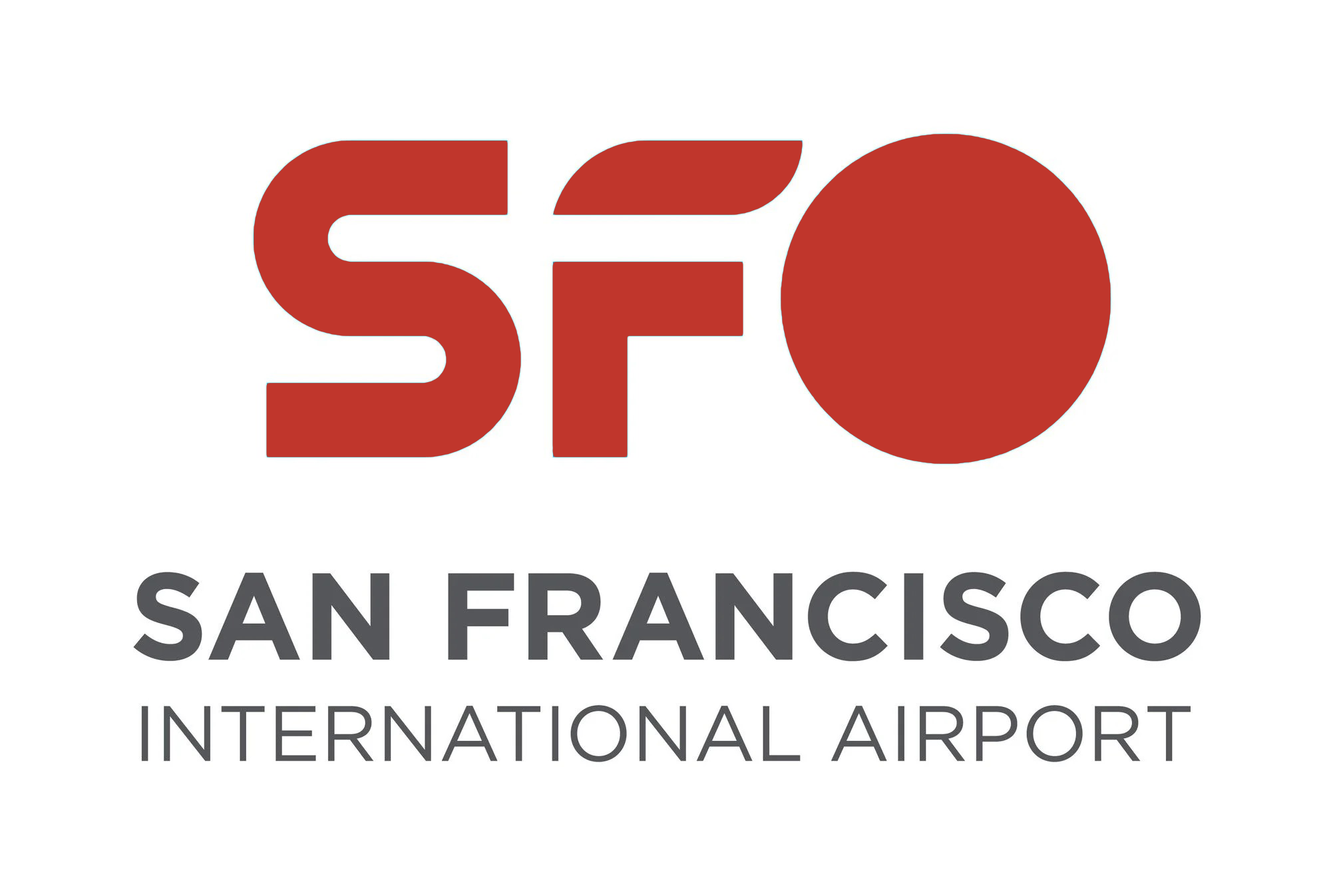
Given that we often make fun of new logos/branding around these parts, I thought it was only fair to point out when there's good work done too. The new logo for San Francisco International Airport is a huge improvement over there old one. That's not saying much as the most recent one was sort of a bare-minimum approach. Still, this one is sort of fun.
A little wing element. Is that a stealth bomber? The whole thing feels a little Star Trek-y, which is appropriate! A lot of clever variations leveraging the "O", which further highlights the "SF". And that last bit matters because of some shenanigans from SF's next door neighbor, Oakland:
It was just about three months ago when Oakland changed the name of Oakland International Airport to San Francisco Bay Oakland International Airport, a move that seems designed to confuse the public. And SF City Attorney David Chiu has sued the City of Oakland, so maybe that new name won’t last. But SF International Airport (SFO) is getting ahead of this one anyway, or at least trying to, as KRON4 reports that SFO just unveiled their own new logo on Wednesday.
"San Francisco Bay Oakland International Airport" is such a joker move. And it's user hostile. How many people are going to be tricked into thinking they're flying into San Francisco and not Oakland by this? It's not a massive deal because both airports are about equal distance to downtown SF.1 But what if, say, you told someone picking you up you were "flying into San Francisco" and they went to the wrong airport? That's going to happen a lot with this name change.
If they wanted to leverage the fact that yes, they are an airport in the San Francisco Bay Area, and yes, sometimes a more convenient airport to fly into than SFO, they should have used the name 'Oakland International Airport on the San Francisco Bay' or the like. This is like the "Los Angeles Angels of Anaheim".2 To be fair, that team is closer to Los Angeles than the "San Francisco 49ers" are to San Francisco (30 miles versus 45 miles).
ANYWAY, back to the logo. If I have a nit, it's the default color:
And above we see the new logo, replacing this old logo that’s been in use since the year 2000. That shade of blue used is a color that they’re calling “SFO Golden Hour Blue.”
"Golden Hour Blue" is silly. It's a fine shade of blue, but it also feels like it's used a lot, as is blue in general.3 If only SF has a more distinctive color associated with the city... you know, like this one. Fixed it:

One more thing: if we want to have a little more fun with "International Orange" (which has multiple variants and the San Francisco Giants seem confused by...)

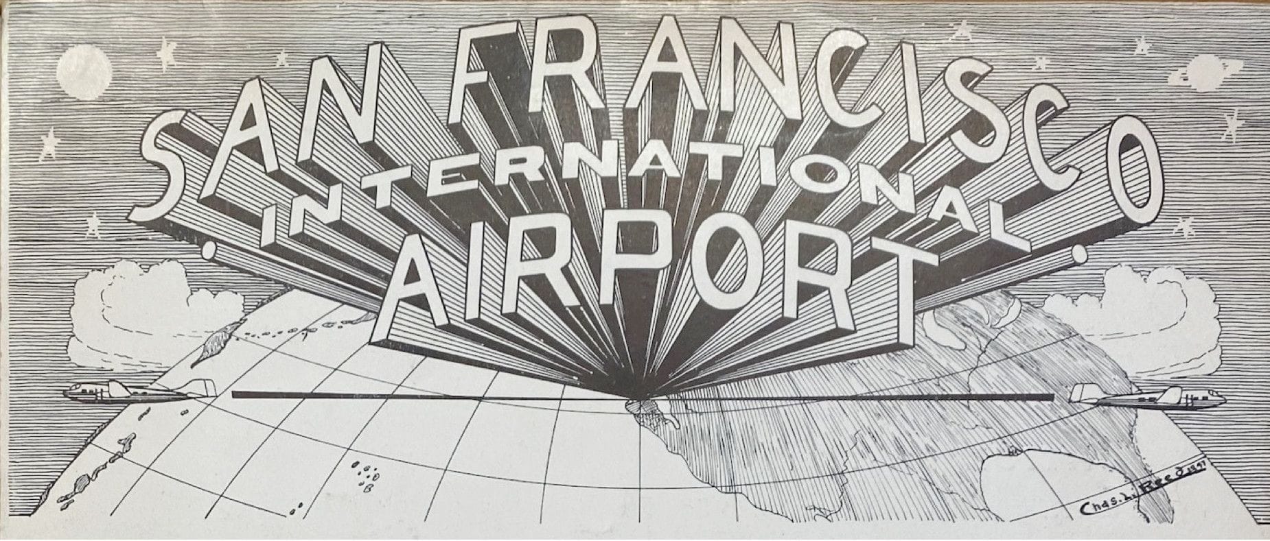
Regardless, it's hard to beat this old school logo:

1 Even just typing this into Google Maps I was tricked! I thought it was looking up the distance from SFO, when I was looking up the distance from "San Francisco Bay Oakland International Airport" (which Google auto-corrected to)!
2 Which are now just the "Los Angeles Angels" – so perhaps Oakland's aim here is to become the "San Francisco Bay International Airport" eventually. I just feel like a city that keeps losing its sports teams should do more to keep their name intact.
3 Understandable, as it's the best color.

